What are the most important things to test?

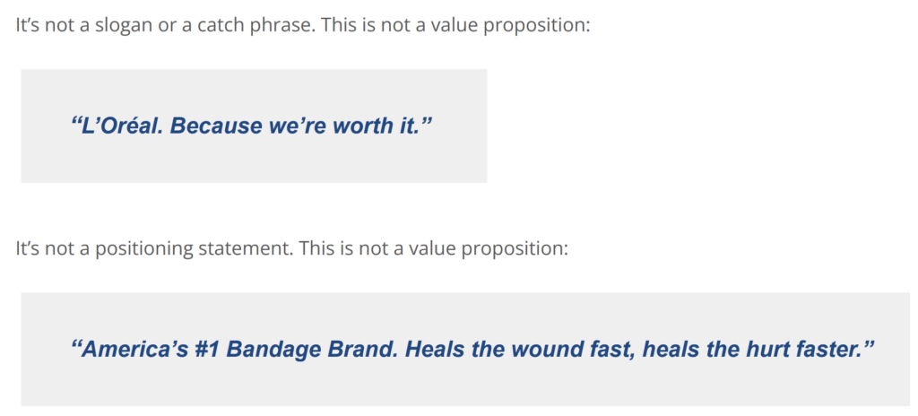
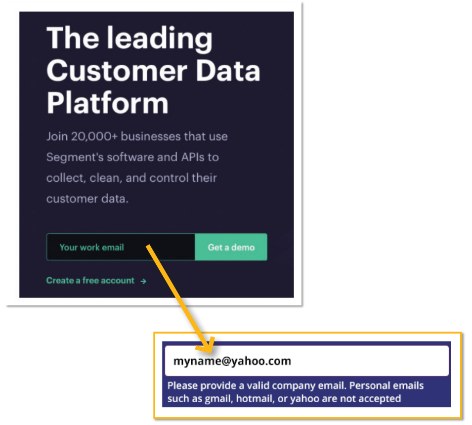
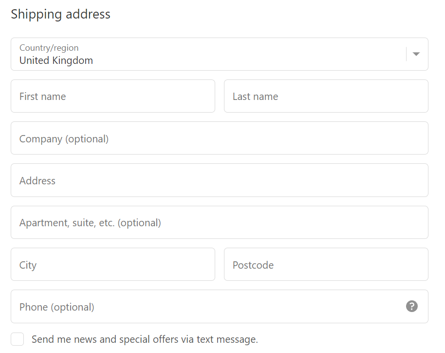
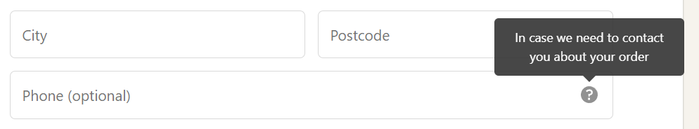
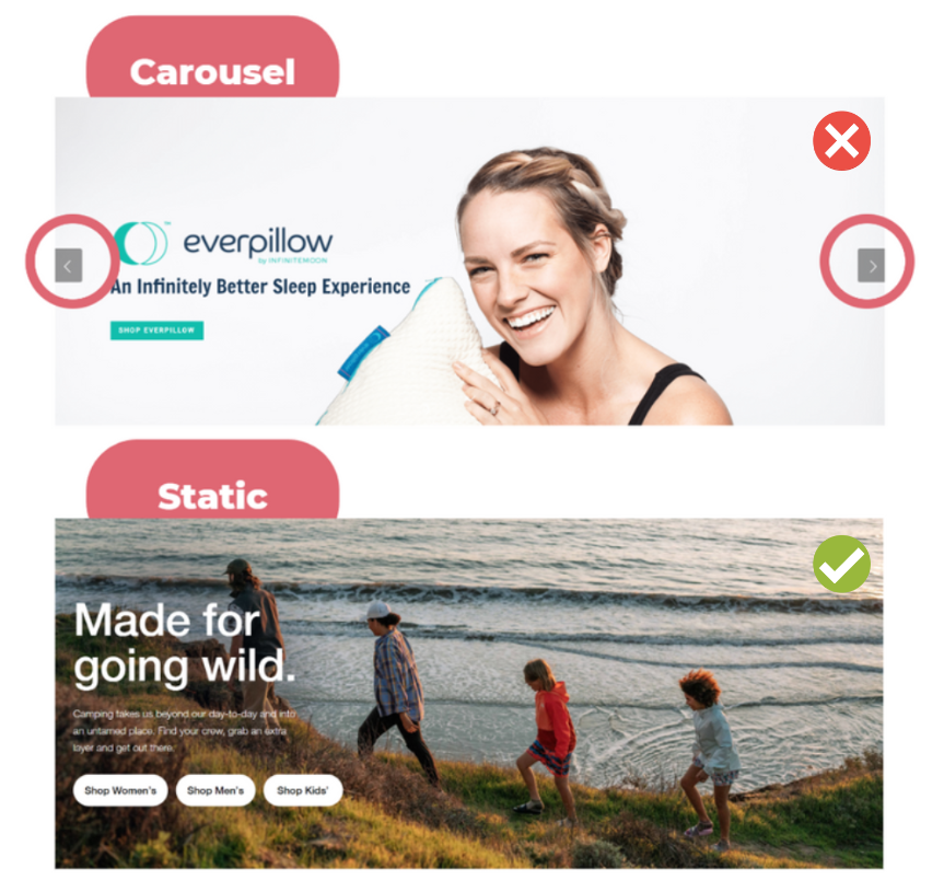
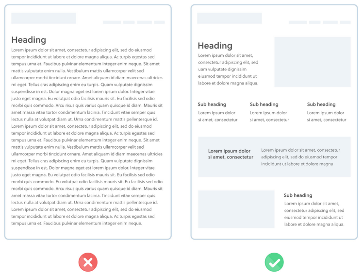
Let your webpage shine as you prioritise the key elements that drive conversions. Evaluate your value proposition to communicate clear advantages and concrete results. Optimise your call-to-action buttons and forms for seamless conversion experiences. Eliminate frictions and create motivation with compelling offers and persuasive sales copy. .

A CRO audit typically involves analysing the various elements of a webpage, but with so many things to consider, it can be overwhelming to know where to start. By applying the Pareto Principle, we’ll focus on the 20% of webpage elements that are responsible for 80% of its conversion rate.

Value Proposition

The Value proposition is the main reason a prospect should buy from you.

    • Does it explain what the product/service is?
    • Does it clearly call out who the product/service is for?
    • Is the copy clear and easy to understand?
    • Does the copy clearly explain what advantages the product/service has over other existing solutions?
    • Does it communicate the concrete results a customer will get from purchasing and using your products and/or services?
    • Are there supporting images and/or videos that help me understand it?

In the following image you will notice that:

  • It’s clear what the product/service is and for whom;
  • There is a specific benefit-oriented sub-headline;
  • It has relevant visuals;
  • Smooth transition into features and benefits.

Call-to-Action (CTA) button

       The CTA button is where visitors convert, and optimizing its design, copy, and placement can make a significant difference in the conversion rate.

  • Does the CTA copy focus on acquiring value or desired outcome?
  • Is the CTA the most visually dominant element in the viewport?
  • Does the CTA copy make it clear what the user will get upon converting?
  • Is it clear what users have to do next?

Examples of call to actions buttons:

Forms

       Forms are a critical element for lead generation and conversions.

  • Does the form ask for the least amount of information required to complete the transaction or qualify a lead?
  • Is the layout of input fields as simple as possible?
  • Does the form clearly and visibly explain what the user error is, where it is located and how to fix it?

Frictions

       Frictions are defined as a psychological resistance to a given element in the sales or sign-up process.

  • Does the page ask for sensitive information? (like phone number)
  • Slow loading pages? (linked to Technical Analysis)
  • Does the site look spammy or amateur?
  • Are there any usability problems?
  • Any low contrast between text and background colors or poor readability?
  • Are there any moving, blinking elements such as banners, automatic sliders?

Motivations

       What incentives do we have for them to convert? Is the offer clear enough to turn motivation into conversion?

  • Is there a clear, benefit-driven offer?
  • Do I understand WHY I should take action?
  • Are features translated into benefits?
  • Is there enough product information?
  • Is the sales copy persuasive?
In the images below, you can see two different ways to motivate users to take an action. The first image show the benefits of a product, while in the second one you can see the concept “push to buy now”. Urgency comes into play when shoppers feel the need to act immediately.

Share this post

Table of Contents

Search

Sub-Categories