Home » Web Design » What are the 7 principles of conversion-centric design (CCD)?
What are the 7 principles of conversion-centric design (CCD)?
Take your website's performance to new heights by implementing Conversion-centered design (CCD) principles. Craft targeted experiences that align with your business goals and drive conversions. .
Anamiodi Agustina
As a business seeking to optimise your website’s performance, you may have heard of Conversion-centered design (CCD). This discipline is specifically targeted at designing experiences that achieve a single business goal, with the ultimate aim of increasing conversions.
So, why should you apply CCD to your Conversion Rate Optimisation plan? By incorporating this discipline into your CRO plan, you can design experiences that guide visitors towards completing a specific action, ultimately leading to higher conversion rates and increased revenue for your business.
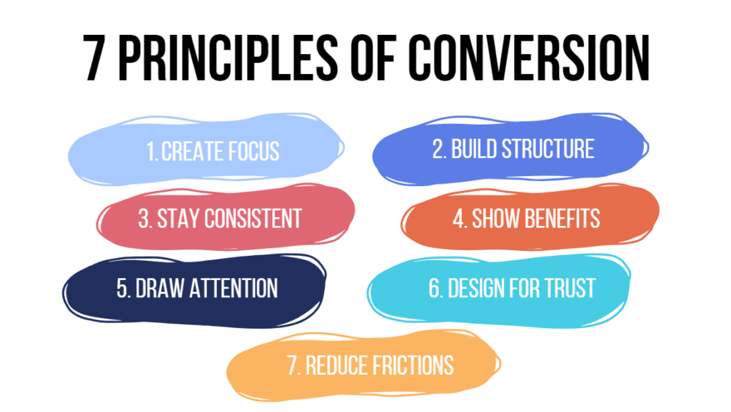
7 Principles of conversions:
Principle #1 Create Focus
The success of your landing page depends on how effectively you can capture your target audience’s attention and guide them towards your desired action. However, with numerous distractions out of your control, like social media notifications or a family message, it’s crucial to limit the distractions that you can control, such as links or the number of options on your page. The first principle of conversion-centered design emphasises the importance of creating focus by ensuring that every design element on your landing page serves one singular campaign goal. Multiple options or calls to action can lead to confusion or distraction.
Think about what you want visitors to do! If something on the page does not get them to that desired result? Remove it. Take out links that point people away, or have them open in a new tab
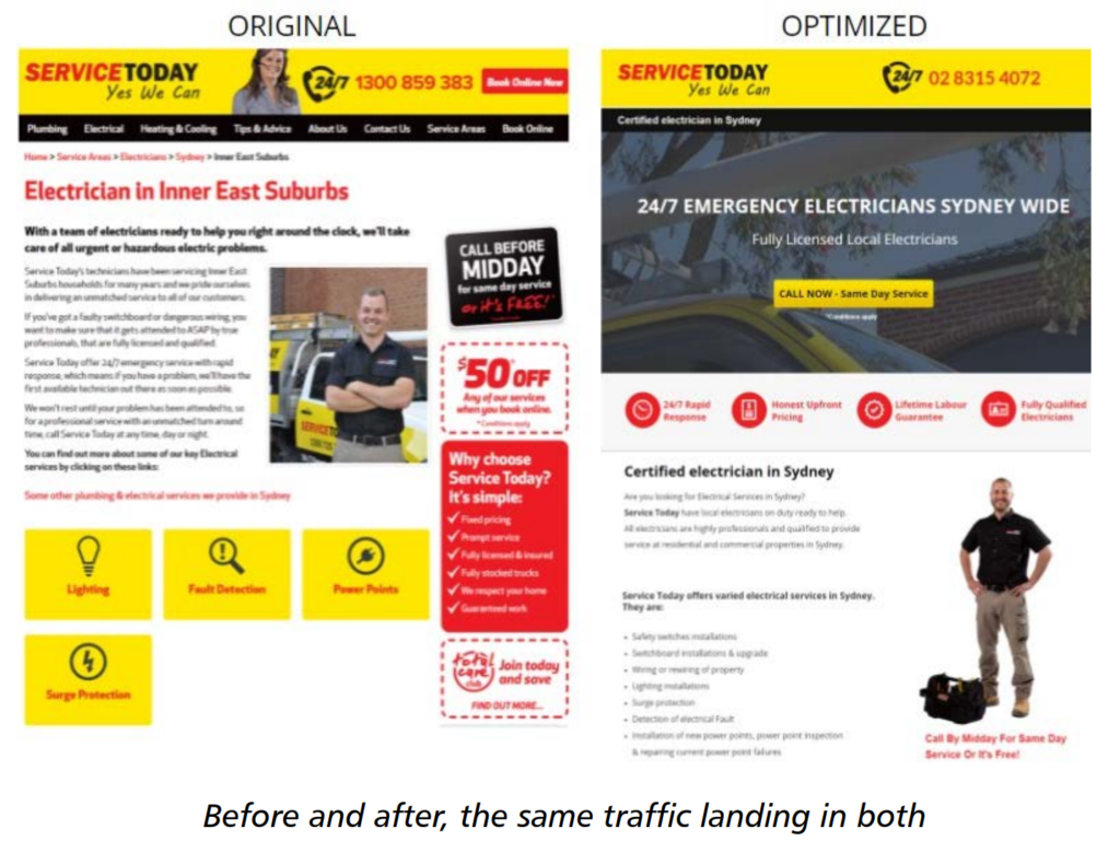
Main differences:
De-clutter: removed all that isn’t relevant to this particular prospect who right now has an emergency
Focalising attention in one main point (the CTA button with ‘Call now’)
Removed many visual distractions (like the yellow squares)
Principle #2 Build Structure
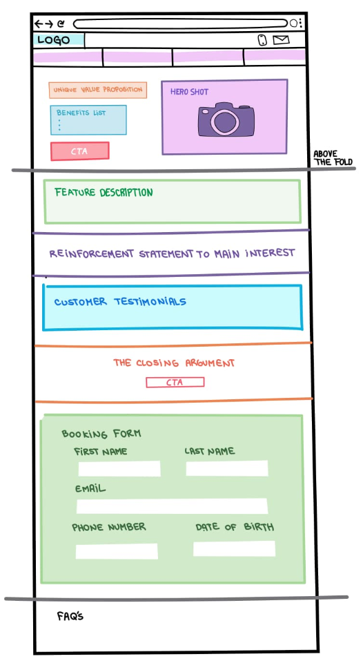
Achieving a balance between visually appealing content and clear calls-to-action is essential to guide visitors towards your goal. Identify the necessary components to support your page’s objective and organise them in a logical sequence. Highlighting the most important pieces will determine the layout of your page and the size of critical sections. Here you have an example:
Principle #3 Stay Consistent
Keep your pages consistent with ad matching, and design guidelines to bring in more conversions. A simple and straightforward design is key to making it easy for the user to understand and take action.
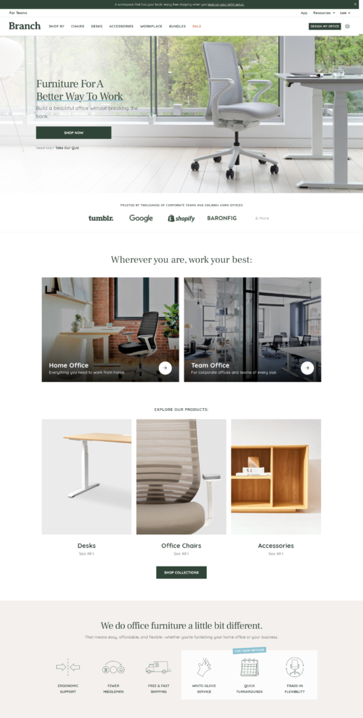
Your brand is really all about the relationships you build with your target customers. Every interaction you have with them contributes to shaping this relationship and how your company is perceived. With regards to your website design, it’s essential to maintain consistency in your choice of fonts, colors, and styles throughout your landing pages and website.
In the image below, you can see how “Branch” use the colours (mostly the green) and the images to create a seamless and coherent user experience across the website.
Principle #4 Show Benefits
Customers will only buy from businesses that offer value, meaning that the benefits of your products or services should outweigh their costs.
Videos, illustrations, and images can help visitors connect with your brand on a deeper level and capture the important intangible emotional benefits you can’t fully express with copywriting alone.
When you show the main benefits of your product/service on your website the users will see that you offers what they need, and they will be more likely to make a purchase.
This example from SnackNation shows how you can have a hero shot that draws attention, but also clearly shows the benefits of the offer.
Principle #5 Draw Attention
Utilize your design to emphasise the key elements that matter most. Colors, fonts, patterns, and shapes. These are the subtle (and sometimes, not-so-subtle) design elements that help you draw attention to particular points of interest on your landing page. You can use them to catch the attention of your visitors and highlight the most important aspect of your page: the call-to-action (CTA).
In the example below, you can see how the CTA button is the most eye-catching element to click on.
Principle #6 Design for Trust
When someone clicks on an ad and lands on your website, they are taking a leap of faith. With so many sketchy websites and spam offers online, building trust with your audience is crucial.
While there are many different types of social proof, testimonials from satisfied customers can be particularly effective. However, it’s important to make sure that your testimonials are not only convincing but also believable. A headshot photo of the person providing the testimonial can be a great way to show that the review comes from a real person.
In addition to a headshot photo, you may include (as in the example image) other identifying details in your testimonials, such as the full customer name, job title, company name, or location.
Principle #7 Reduce Friction
Make it as easy as possible for your visitors to convert.
Frictions are obstacles that prevent customers from taking action, such as complicated checkout processes or slow-loading pages. These frictions can frustrate your website visitors and prevent them from making a purchase.
Understanding the seven principles of conversion is essential for any marketer who wants to increase their conversion rates. By applying these principles, you can create a website that resonates with your target audience, builds trust, and encourages customers to take action.