

Call-to-action buttons are the lifeblood of your online strategy. They serve as the bridge between your audience’s passive engagement with your content and their active participation in your desired actions. From a website visitor becoming a loyal subscriber to an online shopper completing a purchase, the CTA button acts as the catalyst for conversion. But how do you ensure your CTAs are not just ordinary buttons but powerful instruments for eliciting action?
Crafting Persuasive Call-to-Action Copy
- Clarity and Brevity: CTA text should be crystal clear and concise. It should immediately convey what action you want the user to take. Use action-oriented verbs such as “Buy”, “Subscribe”, “Get”, or “Download” to leave no room for ambiguity.
- Value Proposition: Make it evident what users stand to gain from clicking the CTA. Highlight the value or benefit they will receive. For example, “Get 20% off today” is more compelling than “Click here”.
- Urgency and Scarcity: Create a sense of urgency or scarcity to prompt immediate action. Phrases like “Limited-time offer” or “Only 5 left in stock” motivate users to act now rather than procrastinate.
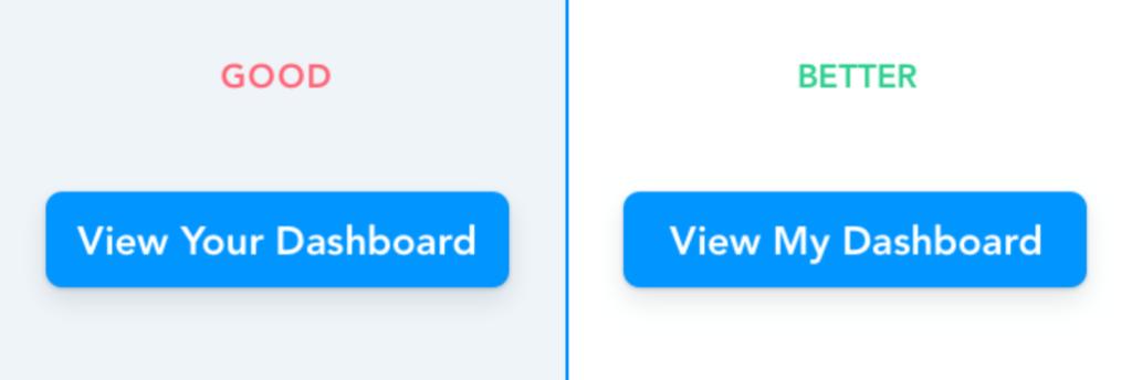
- First-Person Perspective: Personalise your CTA by using first-person language. Instead of “View Your Dashboard”, try “View My Dashboard” This simple tweak can make the user feel more involved and connected to the action.
- Emotional Appeal: Capitalise on emotional triggers in your CTA copy. Emphasize the positive outcomes or feelings users will experience by taking the desired action. For example, “Join our community and transform your life” taps into the desire for personal growth.
- A/B Testing and Iteration: Effective CTA copywriting is not a one-size-fits-all approach. Conduct A/B tests with different copy variations to identify what resonates best with your specific audience. Continuous testing and iteration are key to improving conversion rates over time.
Designing Compelling Call-to-Action Buttons
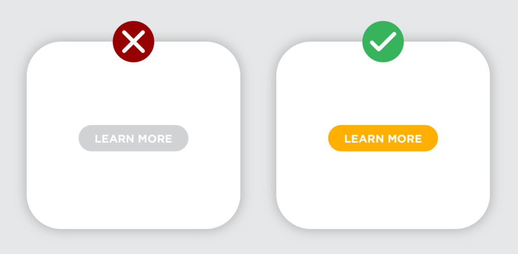
- Color, Contrast and Psychology: Colors play a significant role in influencing human behavior. Different colors evoke various emotions and responses. For instance, red often signifies urgency, green conveys positivity, and blue symbolises trust. Choose a color that aligns with your brand and that ALWAYS stand out from the surrounding elements. Ensure that the text and the button’s background have enough contrast to ensure readability.
- Size, Proportion and Placement: Your CTA button should be of an appropriate size relative to the surrounding content. While it should stand out, it shouldn’t overwhelm the page. Achieve a balance that ensures your button is both noticeable and aesthetically pleasing. Typically, CTAs are positioned near valuable content or product descriptions.
- Whitespace and Clarity: Ensure there’s enough whitespace around the button to make it easily distinguishable. A cluttered design can lead to confusion and reduced click-through rates.
- Button Shape: While square or rectangular buttons are common, you can experiment with rounded corners or custom shapes that align with your brand’s aesthetic. Just remember to maintain a clear visual hierarchy.

- Mobile Optimisation: With the increasing use of mobile devices, make sure your CTA buttons are responsive and easy to tap on small screens. Test them across various devices to ensure a seamless user experience.
In conclusion, call-to-action buttons are not just ordinary website elements; they are the linchpin of your digital marketing strategy. By meticulously designing your CTAs to align with your brand aesthetics, ensuring mobile responsiveness, and crafting persuasive copy that addresses the user’s needs and emotions, you can transform these buttons into conversion powerhouses. Remember, the journey doesn’t end with the design and copywriting; regular testing and adaptation are essential to keep your CTAs effective in an ever-evolving digital landscape.