
In the intricate web of e-commerce, where every click counts and every interaction is a potential conversion, the checkout process stands as the crucible where transactions either flourish or falter. Crafting a seamless and high-converting checkout experience is an art form rooted in the science of consumer psychology and conversion optimisation. In this comprehensive article, we delve deep into the alchemy behind checkout processes, unravelling the secrets that transform casual browsers into committed buyers.
Understanding the Checkout Funnel: A Prelude to Conversion Mastery
1. Landing Pages that Lead to Conversion Goldmines
Your journey to a high-converting checkout process begins long before the user reaches the final stage. The landing page is the gateway, and it must be optimised to captivate attention, convey trust, and guide users seamlessly into the checkout funnel. From attention-grabbing headlines to compelling visuals, every element should whisper, “Your solution is just a click away.”
2. Streamlined Navigation and User Flow
Once through the gateway, users embark on a dance of progress. The navigation and user flow within the checkout process must be intuitive, eliminating any friction that could derail the transaction.
The science of minimising clicks, simplifying forms, and strategically placing calls to action emerges as a fundamental ballet. Understanding and implementing these elements are crucial for guiding users seamlessly through the checkout journey, transforming potential hurdles into a fluid dance of progress.
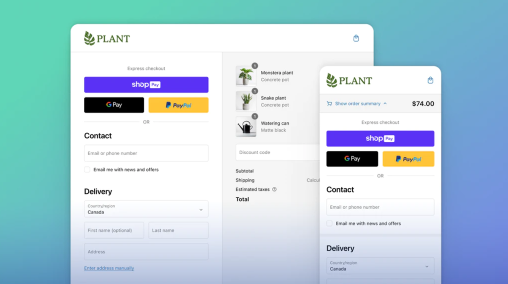
Minimising Clicks
Every additional click in the checkout process introduces a potential point of friction. The science here is rooted in the understanding that users seek efficiency and instant gratification. Minimising clicks aligns with the psychological desire for a straightforward, frictionless experience, reducing the likelihood of users abandoning their carts.
- Single-Page Checkout: Condense the entire checkout process onto a single page, allowing users to review and submit their information in one fluid motion.
- Progressive Disclosure: Reveal information and form fields progressively, showing only what is necessary at each step. This prevents overwhelming users with too many fields upfront.
Simplifying Forms
Complex forms can overwhelm users, leading to cognitive overload and potential abandonment. Simplifying forms is grounded in cognitive psychology, acknowledging that users have limited mental bandwidth. By reducing the cognitive load, you create an environment where users can comfortably provide the necessary information.
- Smart Form Fields: Utilise autofill and predictive text features to minimise manual input, making the process faster and less cumbersome.
- Clear Labeling and Instructions: Clearly label each form field and provide concise instructions to eliminate confusion and uncertainty.
Strategic Placement of Calls to Action
Calls to action (CTAs) are the signposts that guide users through the checkout journey. The strategic placement of CTAs is rooted in decision-making psychology. By presenting well-timed CTAs, you help users progress without feeling lost or overwhelmed, nudging them towards the final commitment.
- Above the Fold: Place primary CTAs prominently above the fold, ensuring users don’t need to scroll to initiate the next step.
- Contextual CTAs: Tailor CTAs to match the context of each step. For example, use “Proceed to Payment” when users have completed address details.
Visual Progress Indicators: Mapping the Journey Ahead
Humans crave a sense of direction and progress. Visual progress indicators tap into this psychological need by providing users with a roadmap of the checkout journey. Knowing where they are and what steps remain reduces anxiety and fosters a sense of control.

The Art of Trust: Building Confidence for Seamless Conversions
3. Transparent Pricing and Policies
Hidden fees and unclear policies can shatter trust in an instant. Understanding the psychology behind transparent pricing is akin to deciphering the unspoken language of trust, erasing doubts, and seamlessly paving the way for conversions.
- Eliminating Uncertainty: When users know what to expect, they feel more in control, reducing anxiety and increasing their willingness to proceed with the purchase.
- Informed Decision-Making: Transparent pricing facilitates informed decision-making. Users, armed with a clear understanding of costs, are less likely to experience buyer’s remorse because their expectations align with the reality of the transaction.
- Trust in Returns and Refunds: When a brand has been transparent about pricing, users are more likely to trust the return and refund processes. Knowing that the brand has been open about costs instills confidence that any issues will be resolved fairly and transparently, reducing anxiety associated with potential returns.
4. Social Proof and Reviews
Nothing speaks louder than the satisfied voices of previous customers. Authentic testimonials directly from customers are the stars of the social proof symphony. These narratives provide a personal touch, allowing potential buyers to relate to the experiences of individuals similar to themselves. The science here lies in the emotional connection formed through shared experiences, fostering a sense of camaraderie and trust.
The Checkout Page Symphony: Harmonising Elements for Conversion Success
5. Strategic Placement of Trust Badges
Trust badges are more than just decorative elements; they are visual anchors that communicate security and reliability. Understanding the psychological impact of trust badges is crucial for their strategic placement.
- Symbolic Assurance: Trust badges act as symbolic assurances, signaling to users that the brand has undergone certain verifications or adheres to industry standards.
- Reducing Perceived Risk: Online transactions inherently involve a level of perceived risk for users. Trust badges work to reduce this perceived risk by offering tangible evidence of the security measures in place. When users see badges representing secure payment methods or SSL certification, their apprehensions diminish, creating a conducive environment for conversion.
Trust badges should not be confined to the initial stages of the user journey. Their presence should extend throughout the entire checkout process. Placing badges on product pages, shopping carts, and payment pages reinforces the continuous commitment to security and trust, assuring users at each step of their transaction.

6. Urgency and Scarcity: The Catalysts of Immediate Action
Creating a sense of urgency and scarcity is a potent psychological trigger. By strategically introducing elements that imply a loss or missed opportunity, brands tap into this powerful psychological trigger, stirring an impulse to act swiftly.
- Fear of Missing Out (FOMO): Urgency and scarcity leverage the Fear of Missing Out (FOMO) phenomenon, a pervasive emotional response in the digital age. Users, driven by the fear that they might miss out on a valuable offer, are motivated to take immediate action to secure the perceived benefits before they disappear.
- Perceived Value Amplification: Time-sensitive elements not only create urgency but also amplify the perceived value of the offer. When users believe they are getting an exclusive deal that is time-bound, the offer becomes more enticing, and the urgency to seize the opportunity intensifies.
Mobile Mastery: Navigating the Checkout Landscape on Small Screens
7. Responsive Design: Adapting the Checkout Symphony for Mobile Audiences
As the digital landscape tilts towards mobile dominance, crafting a high-converting checkout process demands mastery in responsive design.
Mobile interactions are often characterised by brevity, multitasking, and on-the-go engagement. Users on mobile devices expect efficiency, simplicity, and a frictionless experience. Understanding these behaviours sets the stage for tailoring the mobile checkout symphony to meet users’ expectations.
- Brevity and Swift Interactions: Mobile users typically engage in quick, concise interactions. The mobile checkout process should align with this behaviour by minimising unnecessary steps, reducing form fields, and facilitating swift decision-making.
- Guest Checkout Option: Offering a guest checkout option eliminates the need for users to create accounts, catering to their preference for quick transactions. While encouraging account creation can be beneficial, providing a guest checkout option ensures flexibility and caters to users seeking immediate transactions.
- Smart Defaults and Autofill: Reduce user effort by implementing smart defaults and autofill features. Leveraging predictive text, auto-populating fields, and offering suggestions streamlines the input process, aligning with the mobile user’s preference for convenience and efficiency.
Beyond the Purchase: Post-Conversion Nurturing for Long-Term Loyalty
8. Thank You Pages: The Beginning of a Post-Purchase Love Affair
The transaction doesn’t end with a click; it marks the beginning of a post-purchase love affair. Thank you pages serve as a vital epilogue, setting the stage for post-conversion nurturing, brand loyalty, and the potential for repeat business.

9. Post-Purchase Communication: The Bridge to Customer Retention
The art of post-purchase communication goes beyond transactional confirmations; it’s a symphony of follow-up emails, order confirmations, and personalised recommendations that keep the brand alive in the minds of customers long after the checkout is complete.
Testing and Iteration: The Ever-Evolving Symphony
13. A/B Testing
In the world of conversion optimisation, complacency is the enemy. A/B testing, also known as split testing, is the scientific method behind refining every note of your checkout symphony. This iterative experimentation allows you to fine-tune various elements of the user experience, ensuring that your checkout resonates with your audience’s preferences and behaviours.
14. Analytics and Insights: The Conductor's Baton for Conversion Mastery
The final crescendo in the science of high-converting checkout processes lies in analytics and insights. Continuous analysis of user behaviour, conversion rates, and drop-off points serves as the conductor’s baton, guiding strategic enhancements that transform your checkout process into an ever-evolving masterpiece.
Orchestrating Success in the Checkout Symphony
In the grand symphony of e-commerce, the checkout process emerges as the crescendo that defines success or failure. Understanding the science behind high-converting checkout processes is not just a strategic advantage; it’s the mastery that transforms fleeting interactions into lasting customer relationships. As you navigate the intricacies of the checkout symphony, armed with the knowledge unveiled in this comprehensive guide, may your conversions soar, and your customers become loyal patrons in the grand theater of online commerce.