
Forms are a critical component of any website, serving as a gateway for users to interact and provide valuable information. Optimising forms for higher conversion rates requires careful consideration of various factors that impact user experience. In this article, we will delve into the best tips and advice to optimise form performance, ensuring a seamless and user-friendly experience that maximises conversion rates.
Understanding Form Optimisation
Navigating through the digital ecosystem, optimisation is key to enhancing user experience, and that’s especially true when it comes to forms. Primarily, form optimisation is the strategic process of improving the design and functionality of forms to increase user engagement, lead generation and conversion rates. In essence, savvy marketers and website owners employ this approach to make forms easier, more intuitive and less time-consuming to fill out, thereby enhancing the overall user experience and encouraging the completion of desired actions.
To delve deeper, form optimisation begins with understanding your target users, their needs, preferences, and common behaviours, which can be gleaned from analytics and user response studies. This understanding is then applied to modifying form aesthetics such as layout, colour schemes, font types, and button designs as well as their functionalities- reducing the number of form fields, incorporating autofill, real-time validation, single-column designs, and clear, concise labels. It also regards implementing a logical workflow, progress indicators for multi-step forms and mobile-responsive designs. Additionally, form optimisation emphasizes ensuring accessibility, privacy, and security for users, hence the need for captcha and anti-spam measures. The process doesn’t stop after the form is submitted. Follow-up emails, thank you pages and social proof are all part of the post-submission form optimisation strategy. Unquestionably, form optimisation is a holistic, continual process that involves extensive testing, refining, and updating to create a form that resonates with users, boosts engagement and ultimately drives conversions.
Step by Step in Form Optimisation:
1. Focus on the Submit Button
As an integral part of form optimisation, a well-crafted Call-to-Action (CTA) can significantly enhance the user experience and boost conversions. It is the touchpoint where your potential customers decide to either abandon the form or proceed further, thereby directly impacting the performance of your form. A well-crafted, tailored and impactful CTA can act as a practical guide, leading the users to their desired outcomes while achieving your business goals simultaneously.
The colour, size, typography, and language of the CTA should align well with the overall design and tone of your form, attracting attention and promoting user engagement.
A well-designed submit button should address users’ concerns and provide reassurance by answering key questions about what happens next
- What action will be taken upon clicking the submit button?
- What will happen after the form is submitted?
- Is there any additional information or next steps the user should be aware of before submitting the form?
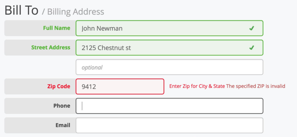
2. Use Inline Validation
Inline validation is a powerful technique that significantly enhances the user experience during the form completion process. By providing real-time feedback to users as they fill out form fields, inline validation serves as a proactive error prevention mechanism. It works by dynamically analysing the input in each field and instantly highlighting any mistakes or inconsistencies, ensuring that users are aware of errors as they occur.
One of the key advantages of inline validation is its ability to prevent users from submitting a form with incorrect or incomplete information. By alerting users to errors in real-time, inline validation allows them to rectify their mistakes immediately, reducing the likelihood of submitting a flawed form. This not only saves time for both users and form handlers but also eliminates the frustration of having to go through the entire submission process again.
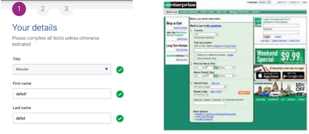
3. Use of Single-Column Design for Forms
Simplicity and clarity are the hallmarks of successful form design. A single-column design offers a clear path of focus for users, reducing the cognitive load and thereby increasing the overall efficiency and user-friendliness of a form. This design principle, widely embraced by user experience experts, follows the natural reading pattern of people: from top to bottom, left to right (in left-to-right languages). By aligning all form elements in one single column, designers can guide users through a form effortlessly, letting the eye flow naturally from one field to the next without confusion or distraction.
The benefits of single-column design are numerous and interrelated. Firstly, it prevents wandering eye movement which may result in potential omission of form fields. Secondly, in cases where form fields are compulsory, single-column design helps to decrease the likelihood of validation errors, as users are more likely to complete the form fields sequentially. Lastly, a single-column layout is more adaptable. In the context of mobile-friendliness, shrinking the viewport width for a single-column layout is straightforward, keeping the responsive design clean and intuitive. Despite the simplicity of this design, it’s powerful in its ability to make forms more comprehensible and user-centric.
A good example of an uncluttered web form And a bad one!
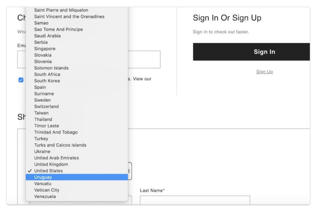
4. Avoid Long Drop Downs
Long drop-down menus, especially when they contain an extensive list of options, can be overwhelming and time-consuming for users. Scrolling through a long list to find the desired option can lead to frustration and may even discourage users from completing the form. To address this challenge, it is advisable to explore alternative options that provide a more efficient and user-friendly experience.
One alternative to long drop-down menus is to implement autocomplete text fields. Autocomplete functionality allows users to begin typing their desired option, and the form dynamically suggests matching options as they type. This feature significantly simplifies the selection process by narrowing down the options based on the user’s input. As users type, the suggested options are refined, making it easier to identify and select the desired choice.
Another alternative is to utilise searchable select options. In this approach, instead of presenting a long list of options in a drop-down menu, users are presented with a searchable input field combined with a select option. Users can start typing in the input field, and the select options dynamically adjust based on their input. As users type, the options that match their input are displayed, making it easier to locate and select the desired choice. This approach offers similar benefits to autocomplete text fields by simplifying the selection process and reducing the time and effort required to find the desired option.
Do not do this…
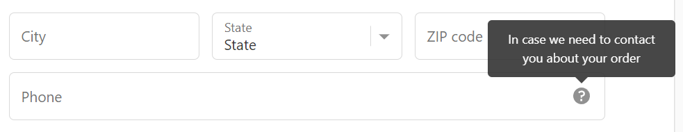
5. Utilise Microcopy to Nudge the User Through the Form
Microcopy is best used to bring clarity to the user on why you need this information and why they should provide it. It refers to the small snippets of text strategically placed throughout a form to provide guidance, motivation, and clarity to users. Well-crafted microcopy can alleviate concerns, boost user confidence, and ultimately increase form completion rates.
By providing concise and clear instructions, microcopy helps users understand what information is required and how it should be entered. It can guide users on the format for specific fields, such as date formats or password requirements, eliminating ambiguity and potential errors. When users have a clear understanding of what is expected from them, they are more likely to proceed with confidence and complete the form accurately.
6. Add Social Proof
Website forms surrounded by quotations, testimonies, or endorsements from satisfied customers provide a level of reassurance to the users about the authenticity and credibility of the service being offered. For instance, a registration form on an e-learning platform can utilise social proof by featuring testimonials from students who have benefited from the courses. Moreover, showcasing the number of users or customers already registered or using a service can also serve as a powerful form of social proof. The key is to ensure that these elements do not distract from the form itself but rather complement it in a user-friendly manner, fostering trust and enhancing the overall user experience. It should also be noted that any social proof used should be genuine and verifiable to maintain the integrity of this strategy.
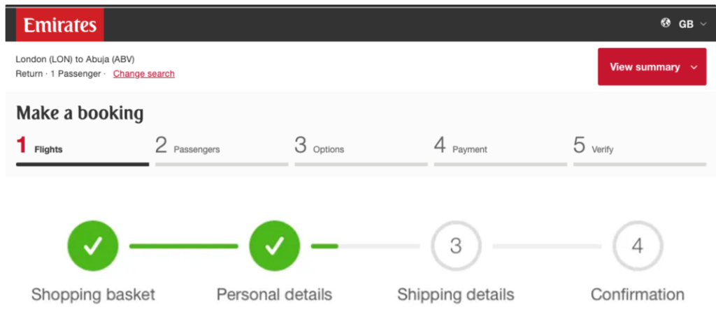
7. Use Progress Indicators
When delving into the realm of form optimisation, a topic of crucial significance is the use of progress indicators for multi-step forms. Progress indicators serve as one of the pivotal tools for enhancing the users’ experience, delivering a clear visual representation of a user’s progress and thus making forms more user-friendly. They instil a sense of progression, which encourages form completion and thereby, increases the likelihood of conversions.
The fundamental premise of a progress indicator is to visually guide users through different phases of a form, particularly those that are long and complex. These indicators could be as simple as a linear bar displaying the completed and remaining sections, or more descriptive with labels specifying the names of the stages. The primary function is to provide users with a snapshot of where they are in the process, what has been accomplished, and what still needs attending. Coupled with an intelligently designed layout, progress indicators can effectively decrease form abandonment rates. Incorporating these into multi-step forms could significantly enhance user engagement and improve overall form performance.
Clear progress indicators encourage users to continue, leading to higher completion rates.
The role of Clear and Concise Labels
Effective label utilisation plays a pivotal role in form optimisation. Labels, much like road signs, guide the user through the form, effectively streamlining the form-filling process. Including clear and concise labels directly impacts usability, reducing user errors and aiding in the form completion rate. Make no mistake, these factors significantly influence the overall user experience.
Triggering user action involves curtailing ambiguity, a principle vital in form design. Labels should be designed with precision, leaving no room for interpretation. Jargons, industry-specific lingo, or ambiguous words may escalate confusion and decrease form conversion rates. Therefore, successful form design incorporates simplicity, relying on everyday language to convey instructions. Less cognitive effort is required by the user translating into higher form completion rates and overall better user experience.
Why Auto-Fill can improve form experience
In the realm of form optimisation, a potent tool that warrants attention is the feature of auto-fill. This powerful feature is often overlooked, yet it can significantly enhance the user experience by streamlining the process of form completion. A seamless interaction with digital forms not only increases the chances of form submission but also can greatly improve perceived user convenience and overall satisfaction.
Auto-fill operates by utilising pre-existing user data to complete relevant form fields. The data is typically sourced from the user’s device, browser or from their interactions with the site. This means that areas such as name, address, and email fields can be populated automatically, saving the user from the repetitive stress of typing this information. This principle is particularly important in e-commerce settings where fast and efficient checkout processes significantly affect conversion rates. However, the value of auto-fill extends beyond e-commerce and can positively impact any digital form that prospects, leads, or customers may encounter, including contact forms, subscription forms, and user registration forms. Furthermore, in a world where mobile browsing is fast becoming the norm, auto-fill proves even more essential due to the difficulty many users encounter when typing on small touchscreen keyboards.
The Importance of a User-Friendly Form
In the digital domain, the way a company communicates with its customers establishes the foundation for enduring relationships. One of the key mediums for this interaction are online forms. The ease and efficiency with which these forms can be completed significantly affect the user experience, determining the overall impression of the business in the minds of the users. It is, therefore, critical to develop user-friendly forms, not just for their information collection role but also as a tool for showing customers how valued their interaction is.
Essentially, a user-friendly form simplifies the interaction process, making it intuitive, straightforward, and efficient for users. Several criteria comprise form usability. These include limited number of fields, clear instructions, easy navigation, optimised for various devices, and an overall design aesthetic that encourages users to engage. Furthermore, mobile forms should be quick to load and easy to navigate through, avoiding the users to scroll horizontally.

These measures make form submission an easy and pleasant experience for the users, increasing the likelihood of form completion and indirectly enhancing your business’s conversion rates.
Businesses that deploy user-friendly forms benefit from higher completion rates, more significant user interactions, and ultimately, enhanced customer satisfaction. Hence, every effort in this direction contributes towards a positive brand experience and higher conversions.
Understanding the power of Thank You Pages
In the digital landscape, the journey of a customer does not end with the submission of a form. It, in fact, segues into a new phase, which holds the potential of either nurturing a strong customer relationship or losing a valuable prospect. That’s where a ‘Thank You’ page comes into play. At its core, a ‘Thank You’ page is a dedicated screen that visitors land on after they submit a form, completing a mini journey in the grand user experience scheme. The importance of this entity is often underplayed in form optimisation, yet it holds immense power.
It begins with acknowledging the action of the user – it tells them that their form submission was successful, fulfilling the basic confirmation requirement. But its utility extends beyond this obvious function. A well-optimised ‘Thank You’ page can play a crucial role in reinforcing the brand message and nurturing the user’s interest in further engagement. It serves as a conduit to guide them to more relevant resources and pathways, be it other related services, helpful blog posts, social media channels, or a user-friendly way to start a free trial. Marketers can utilise this space to prompt the user to subscribe to a newsletter or even serve personalised recommendations and offers based on the user’s data filled in the form. All these efforts aim at capitalising on the user’s current engagement level, transforming a one-time interaction into a potential loyal relationship. In short, leveraging the power of ‘Thank You’ pages unlocks new ways of value creation through form optimisation.
The role of Follow-Up Emails after form submission

Follow-up emails play an indispensable role in maintaining a long-lasting relationship with the customer after they’ve completed a form on your website. These emails serve more than just a courtesy; they are a strategic tool providing an opportunity to further your engagement with the customer, offer them personalised content, address any issues, and potentially upsell or cross-sell your products or services.
A successful follow-up strategy starts by sending a confirmation email instantly after form submission. This first point of contact post-submission not only reassures the user that their response has been received but also paves the way for deeper engagement. Acknowledging their interaction fosters trust and respect. Afterwards, a series of tailored emails should be sent with relevant content based on the submitted form’s information. For instance, the next email could help them make the most out of a purchased product, offer similar products, or provide valuable content about the discussed subject. The timing of these emails is crucial: it should not overwhelm the user, but rather offer support and enrichment. Effectively utilised, follow-up emails not only affirm the user’s decision to engage but also keep your brand at the forefront of their mind, fostering a longer-term relationship.
- The first step in a successful follow-up strategy is sending an immediate confirmation email after form submission. This initial contact reassures the user that their response has been received and sets the stage for deeper engagement.
- Following this, a series of tailored emails should be dispatched based on the information provided in the submitted form. These could include tips to maximise the usage of a purchased product, suggestions for similar products or valuable content related to their interest.
- Consideration must be given to timing these follow-up emails. They should not inundate or overwhelm users but rather serve as support and enrichment tools.
- Effectively utilised, follow-up emails can affirm users’ decision to engage with your brand while keeping it at top-of-mind awareness. This fosters a longer-term relationship between your business and its customers.
- Follow-ups also provide an opportunity for upselling or cross-selling your products/services. By offering personalised content that addresses specific needs or issues raised by customers, businesses can potentially increase sales and customer satisfaction levels.
- Lastly, these emails help maintain open lines of communication between you and your customers—providing them with updates about new products/services, promotional offers, company news etc., thereby fostering ongoing engagement.
Harnessing Analytics to Understand User Behavior
In the digital era, the importance of data cannot be overstated, particularly when it comes to user behavioural analytics. This sophisticated tool provides a detailed look into how users interact with your online form, allowing for a deeper comprehension of their actions, reactions, and overall engagement. By collecting, analysing, and interpreting this data, businesses can make strategic decisions regarding form optimisation that are driven by actual insights rather than assumptions.

User behavioural analytics can deliver a plethora of valuable insights. For instance, it can show where the majority of users abandon the form, suggesting that this particular section may need simplification. It may also highlight how long it generally takes users to complete each field, thereby indicating if certain areas need to be streamlined to prevent user fatigue and enhance user experience. Moreover, businesses can implement heatmap tracking to visualise which parts of the forms receive the most attention. This can be crucial in determining the layout and design of the form. All these measures, and more, can significantly improve user interaction, engagement, and ultimately, form conversion rates. Overall, harnessing analytics undoubtedly takes form optimisation to new heights by delivering actionable insights rooted in user behaviour.
Don't delay, start optimising your forms today
Form optimisation is a dynamic process that empowers businesses to enhance user experiences and drive higher conversion rates. By implementing the best practices discussed above, including enhancing usability, implementing inline validation, providing clear instruction, and integrating social proof businesses can create forms that deliver exceptional user experiences and drive conversions.