In the ever-evolving landscape of e-commerce, having a visually appealing website is just the tip of the iceberg. The real game-changer lies in optimising your product pages for conversions. As online shoppers become more discerning and demanding, a strategic approach to your product pages can make all the difference between a fleeting visitor and a loyal customer.
Understanding Your Target Audience
Creating Customer Personas: To optimise e-commerce product pages effectively, you must understand your target audience inside out. Craft detailed customer personas, considering demographics, preferences, pain points, and aspirations. This forms the foundation for tailoring your content to resonate with their needs.
Analysing User Behaviour: Utilise analytics tools to track user behaviour on your website. Identify popular products, pages with high bounce rates, and the journey users take before making a purchase. This data provides invaluable insights into what works and what needs improvement.
Crafting Attention-Grabbing Headlines
The Power of Magnetic Headlines
Your product page headline is the first thing visitors see. Craft headlines that are not only attention-grabbing but also convey the unique value proposition of your product. Use emotional triggers and powerful words to create a sense of urgency or excitement.
A/B Testing for Headline Optimisation
Implement A/B testing to experiment with different headline variations. Measure the click-through rates and conversion rates to identify which headlines resonate best with your audience. Continuously refine and optimise based on the results.
Captivating Leads and Descriptions

Compelling Product Descriptions
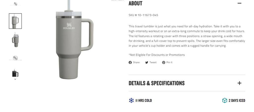
When it comes to providing information to potential buyers, it’s important to strike a balance. While it’s tempting to share as much information as possible about your product, overwhelming potential customers with too much information can be counterproductive.
Not only can it be overwhelming, but it can also make it difficult for buyers to locate the key pieces of information they need to make an informed decision. As a result, the role of product copy is to provide just the right amount of information – enough to pique the buyer’s interest and help them understand why this is the right product for them.
The goal is to create copy that not only captures the buyer’s attention but also arouses their interest, intensifies their desire for the product, and ultimately drives them to take action.
Dive deep into the features and benefits of your products. Craft product descriptions that not only inform but also evoke emotions. Address potential concerns and highlight how your product solves specific problems. Use storytelling techniques to create a connection between the product and the customer.
Visual Appeal with High-Quality Imagery
90% of information transmitted to our brain is visual.
Product images on the web are used as a showcase, so aesthetics and visual communication must be taken care of (emphasize how to present the product). To provide as much information as possible, show how a product looks both alone and in context (allows 3D view, zoom magnifier). When the product is pictured alone, users can focus on its details. When is in context, people can get an idea of how it fits into its surroundings, and how it may fit into their lives.
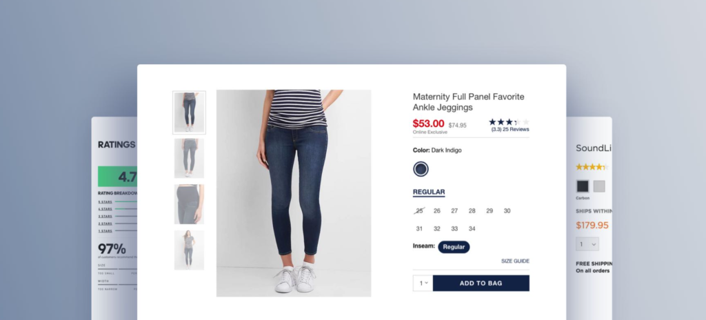
Products designed to be worn apparel; accessories such as bags, jewelry, or watches; and cosmetics require the context of a human model in order to get the truest sense of the product. Combined with other rich product images, “Human Model” images can furnish a more comprehensive picture of the product and help users understand its visual qualities. Without this context, users must estimate the suitability of a product based on other less helpful images and product information, resulting in lower confidence and a lower likelihood to move forward with purchasing.
Another important point is that product pictures should have a simple background (ideally white or grey). The users don’t want to be distracted by irrelevant visuals like a busy background. A neutral and unobtrusive background keeps cognitive load low, allowing your shoppers to focus on the essential aspects of the product picture.
Leveraging Consumer Psychology
Social Proof and Customer Reviews
Starting with a testimonial can be a great way to introduce a product. Positive feedback builds trust and credibility. Pick one that enthusiastically endorses the product and keep it short. Users are usually inclined to click on a highly rated item, but they’re even more inclined when the item has been reviewed by hundreds of people and still maintains this high rating.
By offering these details, you can better inform your users’ decisions and provide them with the confidence they need to make a purchase.

Scarcity and Urgency Techniques
Implement scarcity and urgency elements strategically. Limited-time offers, low stock notifications or exclusive deals create a sense of FOMO (Fear of Missing Out), encouraging visitors to take prompt action.
Guarantees
A guarantee is a powerful sales and marketing tool and not enough companies use them to their advantage. The goal of a guarantee is to combat objections and make a strong statement.
Users need to feel confident that they are making smart purchases. They need to feel comfortable that when they spend their money, the product will last, and if there’s an issue, the item will be fixed or replaced. Offering extended warranties can actually give the users the opportunity to set expectations about what’s covered and what’s not.
Implementing Persuasive Calls to Action (CTAs)
Clear and Compelling CTAs
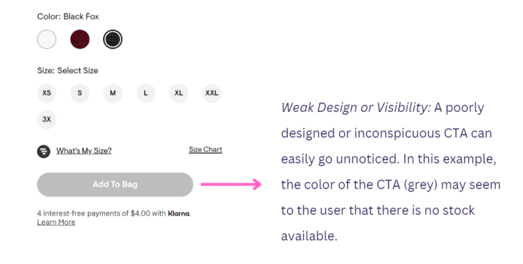
A prominent CTA is one of the most essential parts of a product page. Without a CTA, the user experiences dead ends when shoppers find the product they want to buy.
It has been proved that colours influence the emotions and reactions of users when they are making decisions. Vibrant colours like red and orange are very useful for CTA buttons, but do not abuse these colours because using them in excess could be counterproductive.
When you have a clear “meaning” or the stimulus that each colour causes, you can use it as a tool to increase the percentage of conversions on your website. Everything will depend on the product or service you are offering and the image you want to convey.
The most common one:
- “Buy Now”
- “Add to cart”
- “Checkout now”
- “Add to bag”
Offering a “wish list” or “favourites” button in addition to the “add to cart” button is a positive way to bookmark something the users are considering buying or even to compare products. Some shoppers don’t always intend to make a purchase when viewing a product page.
Test different CTA placements on your product pages. Use heatmaps and user feedback to determine the most effective placement for your audience.

Optimising for Mobile Users
With a significant portion of e-commerce traffic coming from mobile devices, it’s crucial to optimise your product pages for mobile users. Ensure a seamless and intuitive mobile experience, with easy navigation and quick loading times.
Resize and compress images for optimal mobile viewing. Ensure that call-to-action buttons are easily tapable, and the checkout process is streamlined for mobile users.
Streamlining the Checkout Process
One-Page Checkout Optimisation
Simplify the checkout process to reduce friction. Implement a one-page checkout system, allowing customers to complete their purchases with minimal steps. Reduce form fields and offer guest checkout options to enhance user experience.
Transparency in Pricing and Policies
The product price is one of the most important components of e-commerce UX for users evaluating a product. Indeed, for many users, the product price will determine if they’ll even bother to investigate the product further.
Clearly display pricing, shipping costs, and return policies. Hidden fees or unclear information can lead to abandoned carts. Building trust through transparent communication is crucial for converting visitors into customers.
Delivery date
Show estimated shipping time. Some purchases depend on how soon customers can receive an item. Communicate estimated shipping times clearly so your site visitors don’t have to root around to find them.
Users like to see the delivery date as a promise of the site, so it’s important that the calculation is as accurate as possible.
Delivery date calculations should reflect extra order processing time during peak periods, take holidays into account, take the order’s delivery destination into account if it impacts delivery speed, etc. This is particularly important for sites with many gift orders and around the holiday shopping season where users’ concern for timely delivery may be extra high.
Harnessing the Power of Data and Analytics
Continuous Monitoring and Iteration
E-commerce optimisation is an ongoing process. Regularly monitor the performance of your product pages and analyse user feedback. Use A/B testing and heatmaps to identify areas for improvement and iterate on your strategies.
Utilising Retargeting Strategies
Leverage retargeting ads based on user behaviour. If a visitor viewed a product but didn’t make a purchase, retarget them with personalised ads showcasing the same or similar products. This helps re-engage potential customers and nudges them towards conversion.
Conclusion
In the competitive world of e-commerce, optimising product pages for conversions is not a one-size-fits-all task. It requires a deep understanding of your audience, creative copywriting techniques, and a commitment to continuous improvement. By implementing the strategies outlined in this guide and staying attuned to the ever-changing landscape, you’ll be well-equipped to turn your e-commerce website into a conversion powerhouse. Remember, the key is not just to sell products but to create an immersive and satisfying shopping experience that keeps customers coming back for more.

