
In the fast-paced world of e-commerce, one of the critical factors influencing a potential customer’s decision to make a purchase is the checkout process. A seamless and simplified checkout experience can significantly impact your conversion rates.
Understanding the Importance of a Simplified Checkout
1. Reducing Cart Abandonment Rates
High cart abandonment rates refer to the phenomenon where potential customers add items to their online shopping cart but do not complete the purchase. This is a significant challenge for e-commerce businesses, and the checkout process plays a pivotal role in addressing this issue.
Why it’s important:
Users are more likely to abandon their carts if the checkout process is lengthy, confusing, or requires too much time. They might reconsider their purchase if faced with too many form fields, unclear instructions, or a lack of transparency.
How to Address it:
Simplify the steps involved in completing a purchase. Remove unnecessary form fields, ask for essential information only, and guide users through a clear and intuitive process.
2. Improving User Experience
User experience (UX) is a critical factor in online interactions, and the checkout process is a key touchpoint. A convoluted or frustrating checkout experience can leave a lasting negative impression on users, impacting their perception of your brand.
Why it’s important:
A complicated checkout process can lead to frustration, which users may associate with your brand. Negative experiences at this stage may deter customers from returning to your site for future purchases.
How to Address it:
Prioritise a user-friendly design that is easy to navigate. Clearly label form fields, use visual cues to guide users, and ensure that each step in the checkout process is straightforward.
3. Increasing Conversion Rates
Conversion rates represent the percentage of website visitors who take a desired action, such as making a purchase. A user-friendly checkout process directly influences conversion rates, as it reduces barriers and encourages users to complete their transactions.
Why it’s important:
Users are more likely to convert when the process of making a purchase is smooth and hassle-free. Complications, distractions, or uncertainties during the checkout can lead to users abandoning their carts.
How to Address it:
Evaluate each step in the checkout process and eliminate any that are not absolutely necessary. Minimise the number of clicks required to complete a purchase, making it as straightforward as possible.
Analysing Your Current Checkout Process

1. Conducting a Usability Audit
Before making any changes, it’s crucial to evaluate your current checkout process. A usability audit can help identify pain points, bottlenecks, and areas for improvement. Consider gathering feedback from real users and analysing analytics data to pinpoint specific issues.
2. Identifying Friction Points
Friction points in the checkout process can range from excessive form fields to unclear navigation. Identify and address these friction points to create a smoother, more intuitive experience for your users.er mattis, pulvinar dapibus leo.
Simplifying the Checkout Form
1. Implementing Progressive Profiling
Instead of bombarding users with a lengthy form, consider implementing progressive profiling. Break down the information collection process into smaller, more manageable steps, asking for only essential details initially and gathering additional information later.
2. Utilising Autocomplete and Autofill
Simplify the input process by incorporating autocomplete and autofill features. This not only saves time for users but also reduces the chances of errors, enhancing the overall efficiency of the checkout process.
3. Optimising Mobile-Friendly Forms
With the increasing use of mobile devices for online shopping, it’s crucial to optimise your checkout forms for mobile users. Ensure that form fields are easy to tap, and the overall layout remains user-friendly on smaller screens.
Streamlining Payment Options
1. Offering Multiple Payment Methods
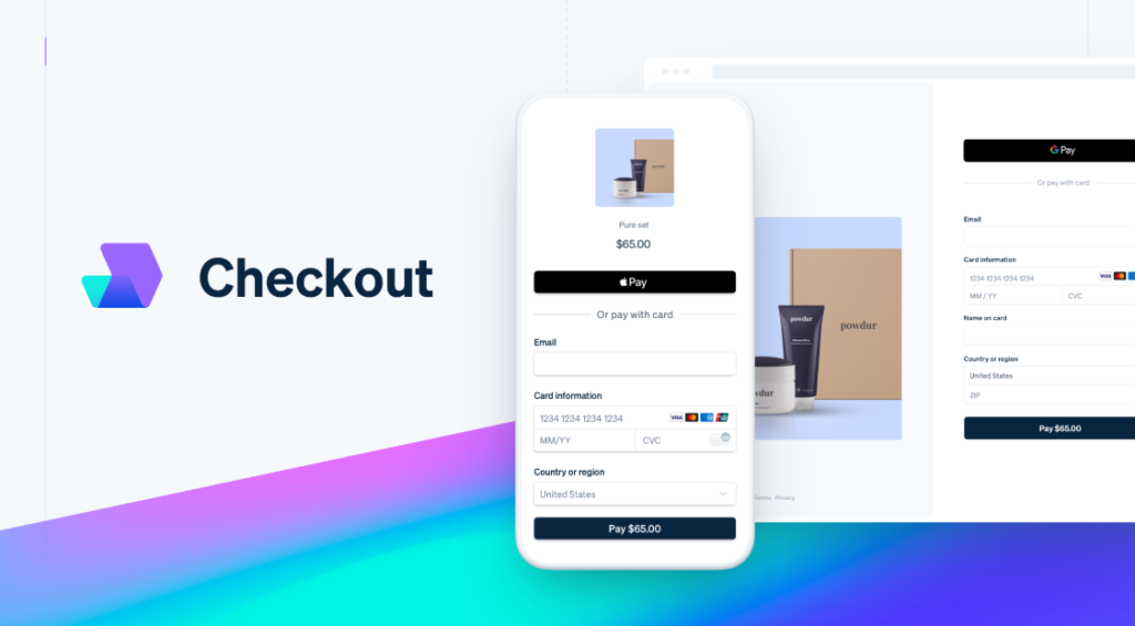
Cater to a diverse audience by providing a variety of payment options. Whether it’s credit cards, digital wallets, or other payment gateways, offering flexibility can increase the likelihood of users completing their purchase.

2. Implementing One-Click Checkout
Streamline the payment process further by incorporating one-click checkout options. Utilise stored user data securely to allow for a swift and hassle-free payment experience.
Enhancing Security and Trust
1. Displaying Trust Seals and Security Icons
Instill confidence in your users by prominently displaying trust seals and security icons. This reassures them that their personal and financial information is secure, mitigating any hesitations they may have about completing the checkout process.
2. Transparent Shipping Costs and Policies
Be transparent about shipping costs and policies. Unexpected charges at the last step can deter users from completing their purchase. Clearly communicate shipping costs and delivery times early in the process.
Optimising the Checkout Page Design
1. Clear and Intuitive Navigation
Ensure that your checkout page has a clear and intuitive layout. Users should easily understand the steps involved in completing their purchase. Use visual cues such as progress bars to indicate their position in the process.
2. Strategic Placement of CTAs
Place your calls-to-action (CTAs) strategically throughout the checkout process. From adding items to the cart to finalising the purchase, guide users with clear and compelling CTAs that prompt action.
3. Minimising Distractions
Keep the checkout page focused on the task at hand. Minimise distractions such as additional offers or irrelevant information that could divert users’ attention and potentially lead to abandonment.
Implementing User-Friendly Error Handling

1. Real-Time Validation
Implement real-time validation for form fields to alert users of errors as they occur. This prevents users from reaching the end of the checkout process only to discover mistakes, reducing frustration and the likelihood of abandonment.
2. Clear Error Messages and Solutions
When errors do occur, provide clear and concise error messages along with actionable solutions. Guide users on how to rectify the issue, ensuring a smooth and frustration-free experience.
Testing and Iterating for Continuous Improvement
1. A/B Testing
Implement A/B testing to compare different versions of your checkout process. Test variations in form layouts, CTAs, and other elements to identify what resonates best with your audience.
2. Gathering User Feedback
Actively seek feedback from users about their checkout experience. Whether through surveys, reviews, or direct communication, understanding their perspectives can unveil valuable insights for ongoing improvement.

Simplifying your checkout process is a strategic investment in enhancing user experience, reducing cart abandonment, and ultimately boosting your conversion rates. By understanding the psychology of your target audience and implementing user-friendly design principles, you can create a streamlined checkout process that not only meets but exceeds user expectations. Regularly assess and refine your approach, staying attuned to the evolving needs and preferences of your audience for sustained success in the competitive world of e-commerce.