
What exactly can you do to make sure you have an efficient website design? While conventional analytics metrics offer invaluable insights, sometimes numbers and charts alone don´t paint the full picture. This is where heatmaps come into play – they offer a visual representation of user interactions, making it easier to pinpoint areas for improvement and enhance the overall user experience.
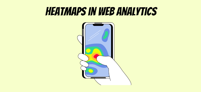
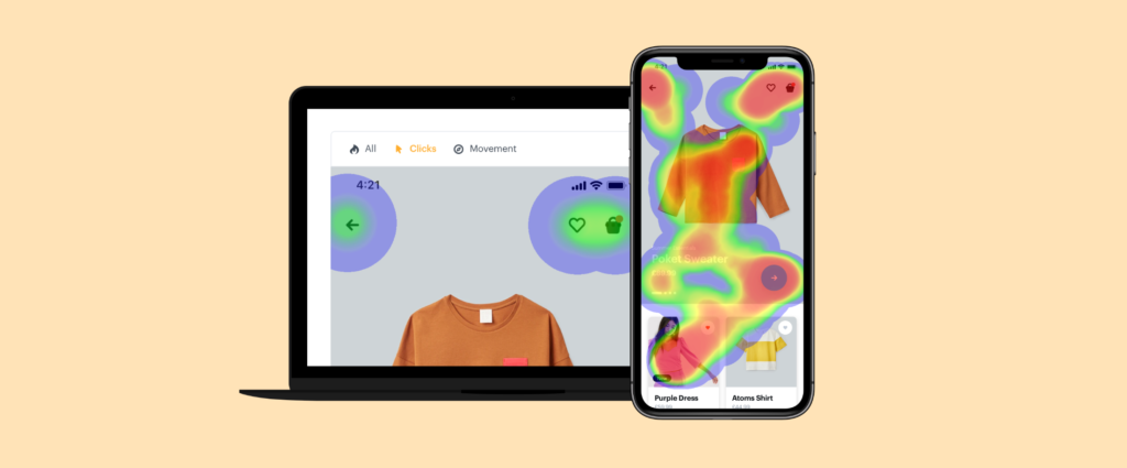
What Are Heatmaps?
Before we dive into the role of heatmaps in web analytics, let’s first understand what they are. Heatmaps are graphical representations that use color to denote different degrees of activity or values, similarly to how geographic weather heatmaps display temperature. By highlighting areas with more activity in warmer hues, heatmaps reveal patterns and trends in user behavior that would otherwise be difficult to detect.
In web analytics, heatmaps are used to visualise how users interact with a webpage. They highlight areas that receive the most and least user attention, providing a visual summary of user behavior. This data, in turn, allows for informed decision making around website design and optimisation efforts.
The Importance of Heatmaps in Conversion Rate Optimisation
Heatmaps become crucial in the field of Conversion Rate Optimisation (CRO) due to multiple reasons. Firstly, they enable marketers and website designers to identify the most clicked or interacted areas of their website. Such information allows the strategists to position their most crucial content, such as CTAs, links, or products in these ‘hot’ areas, thereby increasing their visibility and chances of interaction. Secondly, the tool aids in comprehending elements leading to visitor distraction, allowing modifications to improve user journey and ultimately increase conversions. Moreover, scroll heatmaps can identify the ‘fold’, informing how much of the webpage content is actually being viewed. This, in turn, provides guidance for strategic content placement, ensuring that pivotal information or links are not unseen.
Types of Heatmaps:
There are multiple types of heatmaps, each serving a unique purpose, but all geared towards boosting your website’s effectiveness. Click heatmaps, move heatmaps, and scroll heatmaps are the three fundamental types of heatmaps that communicate distinct aspects of user behavior.
1. Click Heatmaps
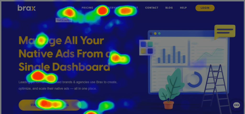
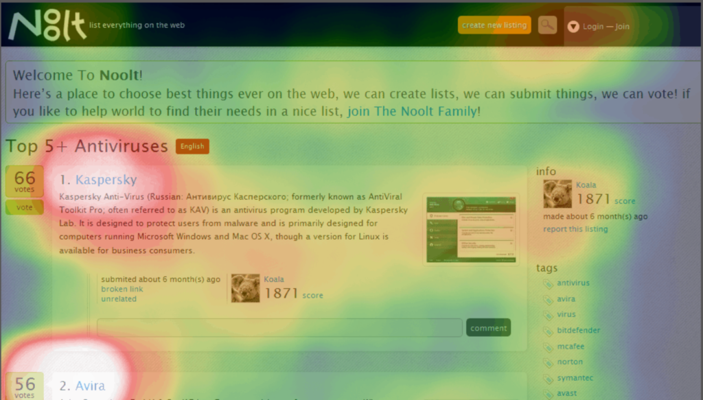
Click heatmaps offer a visual representation of user interaction with specific webpage elements through the metaphor of accumulated temperature. They provide valuable insights into which areas on a webpage are drawing the most attention, represented as ‘hot’ areas with high visitor activity, and which are being ignored, depicted as ‘cold’ areas with less activity. By analysing click heatmaps, you can determine whether your call-to-action buttons are in the right place and whether users are engaging with your content effectively.
2. Move Heatmaps
Move heatmaps show where users move their mouse cursor on a webpage. They can reveal user intent and interest, helping you understand which areas capture the most attention. By analysing move heatmaps, you can optimise the placement of important information and elements, such as menus and product descriptions.
3. Scroll Heatmaps
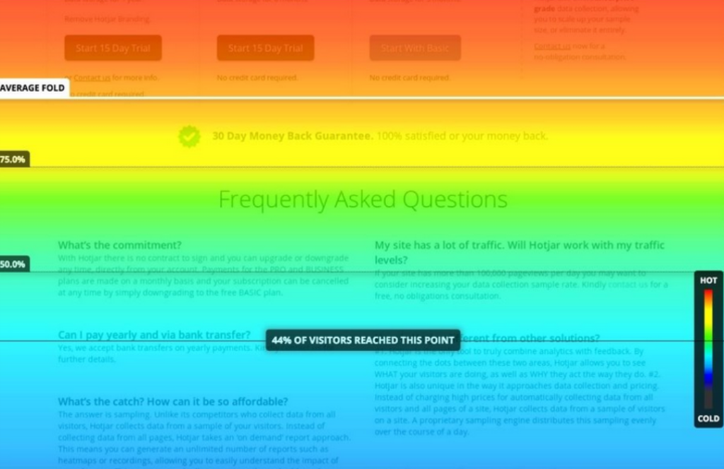
Scroll heatmaps indicate how far down a webpage users scroll before leaving. These heatmaps are particularly useful for identifying the optimal content placement on a page. If users are dropping off before reaching important content, you may need to restructure your page to improve engagement and conversions.
Interpreting Data from Heatmaps
Kickstarting the interpretation process of heatmaps, a key focus should be on specific high-engagement areas, as dictated by warmer color shades like red and orange. These represent sections where users predominantly linger, click, or scroll, indicating specific areas of interest or engagement. It is equally vital to identify the cooler zones, often associated with less interaction, to understand what elements might not be capturing user interest. Considering click heatmaps, for instance, a sparse landscape of clicks could indicate a possible disconnection between what a user wants to do and what the design enables. On the other hand, scroll heatmaps can often pinpoint parts of a webpage that may be too lengthy or insufficiently engaging, prompting users to drop off before reaching crucial information or calls to action. By carefully analysing and interpreting these findings, businesses can create more user-friendly web designs, fine-tune their content, and ultimately, enhance conversion rates.
Common Mistakes in Reading Heatmap Data
Heatmap data can provide a wealth of information when accurately interpreted. However, a misinterpretation can lead to flawed decision making and may adversely affect your website’s conversion rate optimisation (CRO). Being aware of the common mistakes made while reading heatmap data is the first step towards improving the accuracy of your interpretations and the effectiveness of your decisions.
One widespread error is assuming that more intense colors or areas with more activity are always indicative of higher engagement or interest. This assumption is not necessarily accurate as these hotspots might reflect confusion or issues with site navigation, not necessarily engagement. Another common mistake is neglecting to consider the context of the data. For instance, not accounting for device type can skew interpretations. Clicks on a mobile device heatmap will naturally cluster around the center due to thumb reach, this doesn’t necessarily indicate user interest in these areas. Lastly, relying solely on a singular type of heatmap can provide an incomplete picture. Each heatmap variant – click, move, or scroll – offers unique insights. Incorporating all three types can give a more comprehensive view of user behavior.
Continuing on the topic of reading heatmap data, another common mistake is failing to analyse the data over time. Heatmap data should not be viewed as a static snapshot but rather as an evolving pattern that can show how user behavior changes.
● Failing to consider temporal patterns: Just like any other form of data, heatmap information needs to be contextualised within specific time frames. For example, user behavior might differ significantly during weekdays compared to weekends or during holiday seasons versus regular days. Not considering these temporal patterns may lead you to misinterpret your heatmap data and make inaccurate decisions.
● Overlooking sample size: The reliability of your interpretations largely depends on the amount of data collected. Small sample sizes can easily skew results and create misleading hotspots in heatmaps. It’s essential always to ensure that you have enough traffic before drawing conclusions from your heatmaps.
● Ignoring outliers: Outliers are extreme values that deviate substantially from other observations in your dataset. While it’s easy to dismiss them as anomalies, they could sometimes indicate significant issues or opportunities for improvement on your website which shouldn’t be ignored.
● Neglecting new vs returning users distinction: New visitors and returning ones behave differently when navigating a website; thus their interaction with various elements will also vary significantly. Lump summing all visitor interactions without distinguishing between new and return visits may result in skewed interpretations.
Lastly, assuming correlation implies causation is a common pitfall across all forms of analytics including heatmap interpretation.
● Misinterpreting correlation for causation: A hotspot on a particular element does not necessarily mean this element drives engagement or conversions directly – it could just be coincidental or due to some other underlying factor(s). Always strive for deeper analysis beyond what appears at surface level before making strategic decisions based off of heatmap insights.
By avoiding these common mistakes while interpreting heatmaps, businesses can get more accurate insights into customer behavior leading towards more informed decision-making processes.
The Role of Heatmaps in Web Analytics
Now that we know what heatmaps are, let’s explore their crucial role in web analytics:
- Visualising User Behavior: Numbers and statistics can be overwhelming. Heatmaps provide a visual representation of user behavior that is easy to interpret at a glance. They make it simple to identify trends and patterns, helping you understand how users interact with your site.
- Improving User Experience: Heatmaps help you discover pain points and bottlenecks in the user journey. By analysing click heatmaps, you can determine if users are struggling to find essential information or encountering issues with navigation. This insight allows you to make informed design and content decisions to enhance the user experience.
- Optimising Content Placement: Scroll heatmaps reveal how far users are scrolling on your pages. If critical content is buried deep within your website and users rarely reach it, you can use this information to reposition important elements to increase their visibility and impact.
- Enhancing Conversion Rates: Click heatmaps are especially valuable for optimising conversion paths. By understanding where users click and where they don’t, you can fine-tune your call-to-action buttons and forms to improve conversion rates. A well-placed button or link can make a significant difference in achieving your goals, whether it’s making a sale or capturing leads.
- A/B Testing Insights: Heatmaps can also play a pivotal role in A/B testing. When you run A/B tests on different versions of a webpage, heatmaps can help you quickly determine which version performs better by analysing user interactions. This real-time feedback can guide your decisions during the testing phase and streamline the optimisation process.
- Mobile Responsiveness: With the increasing use of mobile devices for browsing, understanding how users interact with your website on different screen sizes is crucial. Heatmaps can provide insights into mobile user behavior, allowing you to optimise the mobile experience for your audience.
How to Leverage Heatmaps in Your Web Analytics Strategy
To harness the power of heatmaps in web analytics, follow these steps:
- Select the Right Heatmap Tool: Choose a reputable heatmap tool that suits your needs and integrates well with your existing web analytics platform.
- Install and Configure: Install the heatmap tool on your website and configure it to collect data. Ensure it’s tracking the necessary interactions, such as clicks, mouse movements, and scrolls.
- Analyse Heatmap Data: Regularly review the heatmap data to identify patterns and trends. Look for areas of high and low user engagement, and use this information to make data-driven decisions.
- Experiment and Optimise: Implement changes to your website based on the insights gained from heatmaps. Test different variations and monitor how they impact user behavior.
- Iterate and Refine: Web analytics is an ongoing process. Continuously iterate and refine your website based on the feedback provided by heatmaps to improve the user experience and achieve your goals.
One crucial step to begin with is having a clear understanding of the objectives of your website. Once the goals are established, you can identify which actions on the site are most valuable and accordingly align your heatmaps.
Heatmaps are indispensable tools in the realm of web analytics. They transform complex user behavior data into easily digestible visual representations, enabling website owners and marketers to make informed decisions that drive improvements in user experience, conversion rates, and overall website performance. If you haven’t already, consider integrating heatmaps into your web analytics strategy and unlock the potential for data-driven growth and optimisation.