
Sound conversion rates and an amasing user experience, when heard together, aren’t merely buzzwords in the digital marketplace. The two symbi
otically intertwine, creating a synergistic relationship that translates into the very lifeblood of a business’s online performance. Hence, comprehending the link between these two is imperative for any industry. In essence, it paves the way for achieving not just profitability but also sustainability in the highly competitive digital space.
For starters, user experience, often abbreviated as UX, encapsulates all points of interaction that a user has with a company, its services, and its products. It strongly influences a visitor’s decision to stay or leave, to purchase or abandon, setting the tone for conversion rates. On the other hand, the conversion rate is essentially the percentage of users who undertake the desired action on a website, a profound metric for a business’s success. Consequently, a user-friendly, intuitive, responsive, and seamless experience not only keeps users engaged but also prompts them to respond positively to the ‘call to action’, thereby establishing a potent correlation with higher conversion rates. Thus, prioritising UX in the business strategy, notably in website design and performance, is not merely optional. It is, in fact, essential and beneficial in the journey of optimising conversion rates.
The Importance of User-Friendly Design
In the digital age, the role of user-friendly design in acquiring and retaining consumers cannot be overstated. It goes beyond creating aesthetic appeal, aiming to facilitate seamless interaction between users and digital platforms that boost engagement, satisfaction, and ultimately, conversion rates. This pivotal aspect of web design merges functionality with aesthetics to deliver a smooth, efficient, and enjoyable user experience.
User-friendly design begins with understanding the target audience and their needs, followed by crafting an intuitive navigation system and information architecture. It involves developing a clear, clean, and aesthetically pleasing interface, which promotes ease of use and fosters user engagement. Key features of user-friendly design often include logical and easy navigation, minimal load time, mobile responsiveness, clear and concise content, and easy-to-understand calls to action. Further, an effective user-friendly design also incorporates principles of accessibility, ensuring that digital platforms are usable by people of all abilities.
Optimising Navigation for Smooth User Journey
In the realm of digital marketing, a primary facet that commands immediate attention is the navigation system of a website. The strength and fluidity of user journey pathways, in no small measure, contribute to the overall user experience (UX). Prioritising these key factors is instrumental in providing seamless interaction with a site and facilitating the attainment of desired objectives.
User journey, essentially, refers to the path a user takes from their point of entry to the final desired action, such as making a purchase, filling a form, or subscribing to a service. To optimise these journeys, the navigation must be intuitive and easy to follow. It is not just about how pretty the navigation tabs look; the functionality and strategic placement have a significant impact on user interface and user experience. Implementing features such as breadcrumb trails and mega menus can greatly enhance a user’s journey through your site. Robust navigation fosters familiarity, providing clear instructions on where to go next, thereby reducing bounce rates and ultimately leading to a higher conversion rate. Here are some strategies to optimise navigation for a smooth user journey:
- Implementing Clear Navigation Labels: Using clear and concise labels for your navigation system can make it easier for users to understand the purpose of each page. Avoid using jargon or industry-specific terms that may confuse users.
- Prioritising Important Pages: Place important pages such as ‘Home’, ‘About Us’ and ‘Contact Us’ prominently on your site’s menu. This ensures that these key pages are easily accessible, consequently improving the overall UX.
- Utilising Breadcrumb Trails: These provide a secondary means of navigating through your website and give users an indication of their current location within the site’s structure.
- Incorporating Mega Menus: For websites with numerous categories or subcategories, mega menus can be beneficial in enhancing usability by providing a comprehensive view of all available options at once.
- Including Search Bars: A search bar is crucial in helping users find what they’re looking for quickly if they cannot locate it within the main menu items.
- Responsive Design Adaptation: Ensure that your website’s navigation is adaptable to different screen sizes, particularly mobile devices where space is limited. This makes browsing more convenient regardless of device used.
By optimising these elements, you stand to improve not only user interface but also enhance customer satisfaction levels. Remember that an efficient navigation system should guide visitors effortlessly towards their desired objectives – whether making purchases or subscribing to services – thereby increasing conversion rates while reducing bounce rates.
Enhancing Readability for Improved User Engagement
With the current digital landscape, user engagement has become a prime focus for developers and content creators. It is paramount to comprehend that the quality of user experience significantly determines the level of engagement. One of the most fundamental features influencing user engagement is the ability to enhance readability. Readability plays a significant role in determining everything from user satisfaction to the SEO ranking. Essentially, improving readability is much more than simply adjusting font size and style; it often requires a holistic approach involving various facets of web design and content creation.
Improving readability begins with the appropriate selection of fonts. A choice of clear and easily readable fonts ensures that users do not face readability issues. This step often involves determining the appropriate font type, size, and color for various elements on the website. The next crucial aspect is the optimum utilisation of white space. White space can significantly enhance readability by reducing clutter and improving text comprehension. Furthermore, the structure of the content or the layout also plays a significant role. Adopting responsive design, short sentences, bulleted lists, subheadings, and highlighted keywords can guide the reader’s eye and make it easier to consume the information. Finally, choosing the right background-foreground contrast can ensure text visibility and readability.
The Crucial Role of Mobile Responsiveness

In today’s digital age, where smartphones have become ubiquitous, mobile responsiveness is of paramount significance when it comes to website design and user experience. As an ever-growing number of customers are accessing websites through their mobile devices, providing a seamless, mobile-optimised experience is no longer an option but a necessity.
Mobile responsiveness entails a web design approach that allows websites to adjust to the screen size and orientation of the device being employed, making for an enhanced browsing experience. From a conversion standpoint, mobile responsiveness is a vital factor. Sites that are not adequately mobile-optimised can lead to frustrated users, ultimately causing them to abandon the page and driving up bounce rates. Importantly, Google’s search engine algorithm also strongly considers mobile compatibility when ranking websites, linking it to higher visibility and organic traffic. Therefore, strategically implemented mobile responsive design can significantly contribute to improved user experience and consequently, higher conversion rates.
Strategies to Speed Up Your Site's Load Time
With the advent of high-speed internet, users now expect instant gratification. Even a few seconds’ delay in page load time can lead to a significant drop in engagement, increase the bounce rate, and negatively impact your conversions. Therefore, ensuring your website loads quickly and efficiently is no longer just a good practice for improving user experience, it is also a critical element for maintaining a competitive edge in today’s digital marketplace.
Starting off, identifying the potential bottlenecks hindering your site’s performance is the first significant step. Tools like PageSpeed Insights and GTmetrix provide comprehensive insights into elements causing slowdowns. Upon identification, aspects like server response time, redirects, render-blocking JavaScript and CSS, uncompressed images or unnecessary plugins can be addressed systematically. Studies show that optimising images can drastically reduce the load time since they account for the majority of the data on most sites. Employing a Content Delivery Network (CDN), leveraging caching and browser loading capabilities for return visitors are also instrumental in enhancing loading speed. Finally, constant monitoring, timely updates and implementing a mobile-first approach will conclusively cut down on load time, serving to bolster overall site performance, user experience and conversion rates.
Designing Content Layout for Optimal Engagement
A user-friendly website boasts of not just clever functionality but also innovative design. While aesthetic appeal attracts users to linger on the webpage, thoughtful organisation of content can considerably elevate their engagement, with the potential to convert passive visitors into active participants or customers. The arrangement, distribution, and presentation of information matter greatly in harnessing visitors’ fleeting attention span and urging them to act. To that effect, designing the content layout emerges as a crucial aspect of user engagement and thereby, an influential factor in boosting conversion rates.
Intuitive content layout starts with understanding the target audience and their browsing habits. It should provide users a visually comfortable and logically sequenced reading path, guiding them through the important elements of the page without losing their interest. A well-designed content layout, traditionally in an ‘F’ or a ‘Z’ pattern, should contain strategically placed headlines, subheadings, text, images, and other multimedia elements that are easy to skim through and can deliver the main idea rapidly.

Furthermore, the inclusion of clear and enticing ‘Call-to-Action’ buttons at appropriate intervals can potentially trigger instant response from the users.
While the aesthetics of minimalist design “less is more”, can make the layout appealing, the utilisation of color psychology can subtly enhance user engagement, potentially driving user emotions and actions towards the desired direction. Every component, from color palettes to typography, should serve a specific purpose, contributing to a cohesive design structure. A central theme in this design concept is the generous use of whitespace. It serves to create visual breathing spaces, accentuating key elements while fostering a sense of calm, balance, and elegance.
Ultimately, the primary objective is to create a seamless, enjoyable user journey that keeps them engrossed, extracts value, elicits trust, and prompts action. As digital trends evolve, so should the content layout design, staying in tune with users’ shifting behaviors and preferences to optimise engagement, and in turn, conversion rates.
How to Create Clear and Concise Calls to Action??
A crucial aspect of user experience design is the strategic implementation of clear and concise calls to action (CTAs). In essence, CTAs serve as the direct line of communication between the website interface and the users, guiding them towards the desired action or conversion. Whether your end goal is to drive newsletter signups, enable product purchases or push survey participation, high-quality CTAs could make or break your conversion rates.
Designing an effective CTA involves perfect alignment between the context, language, design, and placement. The CTA must first and foremost be unambiguous in its message, prompting users to take a specific action. Utilising a commanding language like “Sign up,” “Buy now,” or “Learn more” can ensure users know exactly what is expected. Furthermore, vibrantly contrasting colors can help your CTA button stand out on the page, grabbing attention without clashing with the overall site aesthetics. Positioning also plays a vital role – the CTA should be placed intelligibly within the user’s gaze flow in a strategic manner that seems neither forceful nor distant. Lastly, testing various CTA versions via A/B testing can help identify the most persuading setup to maximise conversions.
Leveraging Social Proof to Boost Trust and Conversions
Social proof, our inherent tendency to mirror the choices of those around us, forms a critical pillar of online consumer behavior. The concept is rooted in our need for social validation or reassurance, and plays a vital role in influencing purchase decisions. In simple terms, if we see a multitude of individuals endorsing or buying a product, we are more likely to follow suit and do the same. However, it’s important to remember that harnessing social proof is not just about gathering positive reviews; it’s about strategically using these testimonials, endorsements, and reviews to maximise trust and conversions.
The effective application of social proof begins with understanding the different forms it can take, such as customer testimonials, celebrity endorsements, expert approvals, and user statistics. Integrating these elements into strategic points on a website can elevate a brand’s credibility and make the purchase decision easier for visitors. For instance, showcasing customer testimonials on the product page may provide validation to potential customers. Similarly, displaying user statistics such as ‘1000+ items sold’ or ‘5000+ satisfied customers’ taps into the human tendency to conform to popular opinion. Brands must also ensure transparency and authenticity in these testamentary forms of social proof. After all, in the digital landscape, consumer trust is a precious asset — hard-won and easily lost. This trust is instrumental in driving conversions and a website’s overall performance.
Effective Use of Images and Multimedia
Utilising images and multimedia elements wisely can significantly enhance the user experience and, consequently, conversion rates. Rich visual content aids in simplifying complex information, making it easier for users to understand and digest. Furthermore, these elements can break up textual content, providing a respite for the reader’s eyes and making lengthy content appear less daunting. This intentional and strategic placement of visuals not only impedes user fatigue but also fosters increased engagement and user retention, ultimately leading to higher conversion rates.
To elevate visitor engagement, consider integrating relevant, high-quality images, infographics, and videos into your website’s design. Tailoring this visual content to align with the tastes and preferences of your target demographic can have pronounced rewards. For images, usage of alt text and proper file naming conventions can boost SEO performance, while embedding videos should be done with care to avoid negatively impacting page load speed. On the subject of multimedia, it’s vital to ensure the content is responsive and appropriately optimised for a range of devices including mobile phones, tablets, and desktop platforms. Lastly, use these elements to establish an emotional connection with your audience, and clearly illustrate your brand’s message. This way, through effective use of images and multimedia, businesses can improve user experience, while simultaneously ramping up their conversion rates.
The Power of A/B Testing in Conversion Rate Optimisation
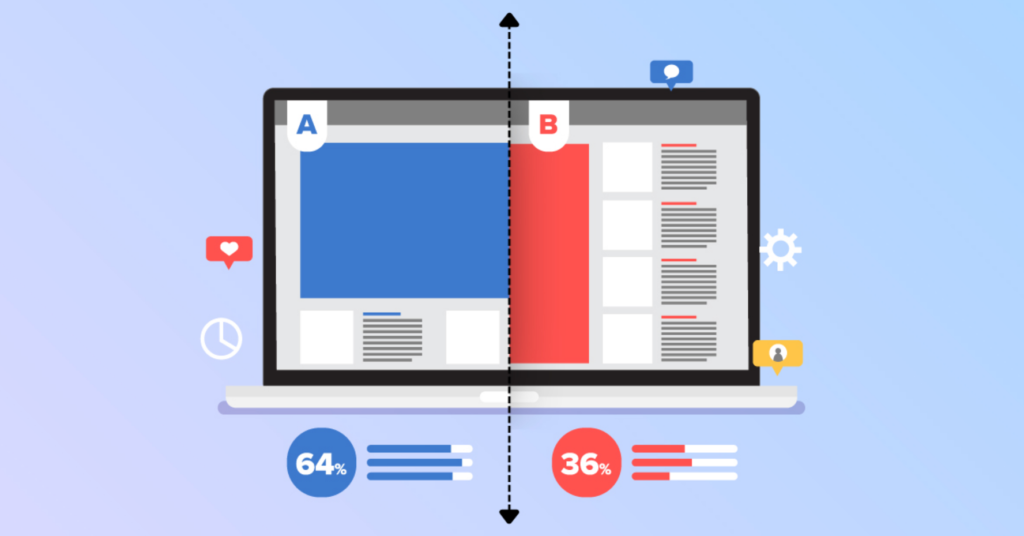
A/B testing is an invaluable tool for businesses seeking to optimise their conversion rates. Known as split testing, it involves a comparative experiment to determine which version of a webpage, advertisement, email, or other digital property performs best in terms of converting users into customers. This method provides a statistical analysis of user behavior which gives insights about which factors are influential in driving conversions, thereby enabling firms to optimise their digital assets for advanced performance.
With A/B testing, two versions of the same webpage/index – ‘A’ being the control and ‘B’ the variant are shown to users in a randomised manner. The layout, color scheme, call-to-action placements or any other variable might be different in these versions. Several performance metrics are then observed and recorded, such as click-through rates, time spent on page, bounce rate or completed sales. Analysing the data from these metrics helps businesses identify what elements or changes on the webpage lead to better user engagement and higher conversion rates. This way, businesses can make data-driven decisions to improve their user experience and conversion rates. A/B testing thus provides opportunities for continuous improvement, adaptability and revenue growth.
The Impact of Color Psychology in User Engagement
Undeniably, the strategic application of color psychology can significantly influence user engagement. These effects weave themselves subtly into desirability, functionality, and the overall visual appeal of a website, in turn impacting the way users perceive, interact with, and experience the platform. This illuminates the connection between color choices and users’ emotional responses, advancing our understanding of how user engagement can be shaped by such a seemingly straightforward aspect of design.
To comprehensively comprehend and utilise color psychology, we should start by understanding that different colors evoke varying emotional responses. For instance, blue often corresponds with trust and reliability, making it a favorite choice for corporate and banking websites. A stark contrast, red signifies urgency, passion, or alertness, thereby making it ideal for call-to-action buttons or limited time offers. Following this line of thought, the application of appropriate colors can create an emotional environment that encourages specific user behavior, effectively aiding in enhancing engagement and boosting conversion rates. Through careful consideration of the psychological implications of color, designers can construct emotionally engaging platforms that steer user actions in the desired direction.
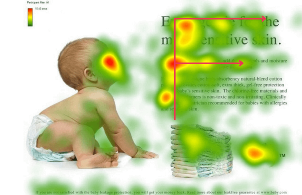
Creating Scannable Content for Quick Information Retrieval
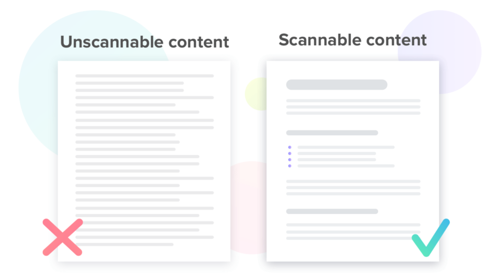
In the digital era where an overload of information is bombarding users, creating scannable content has emerged as an essential business strategy. With a seemingly infinite expanse of content just a click away, consumers now exhibit unprecedented impatience and reluctance to spend much time reading. Instead, web users often scan webpages, picking out individual words and sentences. In response to this shift, businesses need to adapt their content strategies accordingly, crafting content that can be swiftly and effectively consumed.
Creating scannable content demands an in-depth understanding of user behavior and preferences. Eye-tracking studies reveal that users commonly scan in an ‘F’ pattern, typically reading the first few lines of the text in detail before scanning the rest of the content in a more cursory manner. To accommodate these scanning habits, content should prioritise the most critical information at the top. Furthermore, clear headings, bullet points, bolded text, meaningful hyperlinks, and digestible chunks of text can lead to a more scan-friendly layout. This type of approachable formatting helps users swiftly navigate your content, retrieve necessary information, and ultimately contribute to higher user engagement and conversion rates.
The Role of Customer Reviews in Conversion Rate Optimisation
Increasingly, the potent impact of customer reviews on conversion rate optimisation is becoming recognised by businesses. As a highly influential factor, it engages potential customers by fostering a sense of trust in the quality and reliability of products and services. Acting as snapshots of user satisfaction, these reviews resonate with potential customers, significantly influencing the purchase decisions and thereby playing a direct role in conversion rate optimisation.
Customer reviews serve as a proof of credibility and authenticity. A string of positive reviews provides potential customers with assurance over their contemplated choices. However, negative reviews are not simply loss-makers. They offer invaluable insights into the areas that a business needs to improve. Timely addressed negative feedback, transforms a dissatisfied customer into a loyal one, imparting a highly positive impression on other potential customers. Thus, customer reviews, whether positive or negative, should be a core component in a company’s conversion rate optimisation strategy, acting as powerful tools in driving customer engagement, retention and conversions.
The Use of Chatbots for Improved User Guidance
Chatbots are emerging as a powerful tool in enhancing user guidance and improving the overall digital customer experience. Their functionality, harnessed with artificial intelligence and natural language processing, lends itself to creating a seamless, automated yet personalised user guidance system. Deployed judiciously, chatbots hold significant potential to boost user engagement, navigate users’ pain points, and ultimately augment conversion rates.

The integration of chatbots begins with clearly defining their purpose, which may include round-the-clock customer service, resolving user queries, guiding user navigation, or even upselling. However, paramount to their successful implementation, is for them to be conversational and intuitive, effortlessly guiding the user through the website without overwhelming them. Developing a chatbot script that aligns with brand tone and language, fits the chats flow and answers potential FAQs enhances its effectiveness. Additionally, continuous monitoring and optimisation based on gathered user information assists in improving the chatbot’s performance, adaptive responses and overall customer service.
Final Thoughts: Constantly Evolving with User Preferences and Trends.
User experience and conversion rates have an intimate relationship that is complex yet decipherable to those who seek to unravel its mysteries. Trends, preferences, and technological advancements persistently transform this relationship, making it vital for brands to evolve consistently ensuring an enhanced user experience. In the ever-changing digital landscape, keeping up with these variables can become a daunting task. However, understanding and implementing progressive strategies associated with user-friendly design, navigation optimisation, content readability, mobile responsiveness, page load speed, precise and concise calls to action, and amongst others, can significantly aid in the process.
From the earliest stages of designing the content layout to the strategic position of CTAs, the principles of minimalist design and the use of influential images and multimedia play essential roles. Evoking a sense of trust and authenticity through social proof, engaging customer reviews, and intelligent chatbot use can remarkably enhance user engagement and consequently increase conversion rates. Additionally, adopting accessibility standards and color psychology can further amplify user reach and interaction, structuring a more inclusive and appealing digital environment. Through continuous innovation, regular evaluations symbolised by A/B testing and evolving with the user’s changing preferences, businesses can thrive in this dynamic digital marketplace. Remember, in the wide cosmos of user experience, evolution is not just beneficial- it is imperative.