

Landing pages serve as the pivotal point for ensuring the success of digital marketing campaigns. They are specifically designed to convert visitors into potential leads and further into loyal customers, thereby impacting bottom-line business growth. Their core function resides not only in providing pertinent information about a particular product or service, but also in persuading visitors to take a particular action – whether it is downloading a freebie, signing up for a newsletter, or purchasing a product or service. Therefore, their importance in driving increased conversion rates cannot be overstated.
Crafting a high-converting landing page requires strategic planning, starting from understanding the target audience and their pain points to offering a unique value statement and a compelling call to action. It’s key to recall that effective landing pages are user-centric, and that they align with multiple design and content elements to persuade visitors. Essential elements of a successful landing page include headlines, sub-headlines, relevant copy, high-quality images, form fields, call-to-action buttons, social proof, video content, testimonial section, trust signals, and colour psychology, among others. Each of these elements, used effectively, creates a harmonious blend that sparks user engagement, facilitating conversions. Understanding their role and leveraging them effectively thus forms the foundation in crafting high-converting landing pages.
Essential Elements of a Successful Landing Page
A high-performing landing page harnesses a particular set of critical elements, each playing a vital role in driving conversion rates. No matter the industry, business, or product, these key factors remain constant and indispensable. Together, they form a highly adaptable foundation that inspires the visitor’s interest, builds trust, facilitates comprehension, and ultimately, compels an action.
1. Unique Value Proposition
Your Unique Value Proposition is where you present your core description of what the page is about. The more you understand your audience, the better the way you group them, then the more understanding you will have of what´s the right level of information needed.
Headlines hold a pivotal position in the setup of a compelling landing page. Attracting the visitor’s attention, they set the stage for what the potential customer can expect to find on the page. Primarily, a headline must communicate the value proposition of the product or service being advertised, ideally succinctly and engagingly. They work as the entry point for the user’s journey on the page and potentially through the site, thus underscoring their weight in the conversion process.
An effective headline must fulfil a few critical responsibilities. First, it should capture the audience’s attention with appealing and persuasive language. Simultaneously, it must convey the offering’s uniqueness and prompt users to dwell on the page longer to explore its contents. Additionally, accurately summarising the product’s key benefits can make the headline more compelling and targeted. Since landing page real estate is invaluable, the headline’s brevity and clarity become essential in striking a chord with the audience. Understanding these nuances enables marketers to leverage headlines as powerful conversion tools on their landing pages.

Additionally, a supporting headline can be used to extend the message and provide an additional persuasive element to support the primary one. The supporting headline is the best way to keep your headline short and sweet.
If people can’t determine the purpose of your page from the main headline (and subhead) you’re doing something wrong.
In a nutshell, a value proposition is a clear statement that offers three things:
- Relevancy. Explain how your product solves customers’ problems or improves their situation.
- Quantified value. Deliver specific benefits.
- Differentiation. Tell the ideal customer why they should buy from you and not from the competition.
2. The Power of Visuals: Engaging Customers with Hero Shots
Visuals have a profound impact on landing page effectiveness. The hero shot, a visually striking image or photograph that showcases your product or service, is critical in making a strong first impression. It should immediately convey what your page is about and entice visitors to explore further.
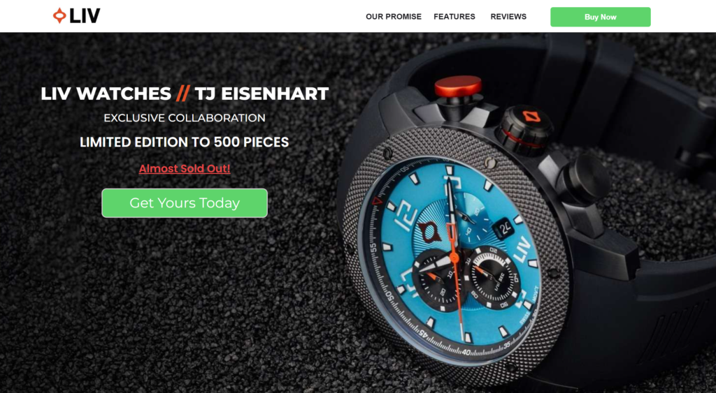
From the perspective of optimisation, images elevate the appearance and credibility of the landing page, foster engagement, and decrease bounce rates. Hence, the images on your landing page should be wisely selected and strategically placed. They should align with your brand aesthetics, cater to your target audience, be high-resolution, and load with optimal speed. Remember, incorporating high-quality images is not just about making your landing page visually appealing; it’s about crafting a compelling visual story to enhance user experience and consequently drive conversion rates upwards.
People vs. Product Photos There’s compelling evidence to suggest that featuring a photograph of a real-life person will get you a higher conversion rate than a photo or screenshot of your product. This is because such images are more memorable and foster empathy in viewers, increasing the likelihood of conversion.
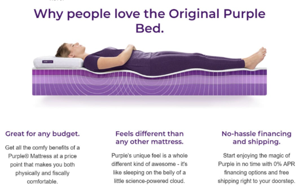
3. Communicating Benefits Effectively
Highlighting the benefits of your product or service is crucial to driving conversions.
To effectively communicate these benefits, it’s essential to understand the pain points of your target audience and demonstrate how your offering solves their problems.
Ask yourself, “What do my potential customers need?” and write down concise, one-sentence solutions to those needs. Remember to focus on the value your offering brings to customers, emphasising what they gain rather than what they spend.
People don’t want to think about the money they’re losing when they buy something from your site. They want to think about what they’re gaining. Ecommerce today is about offering more than just the product you’re selling. People want to know who they’re buying from and your offer page should reflect that.
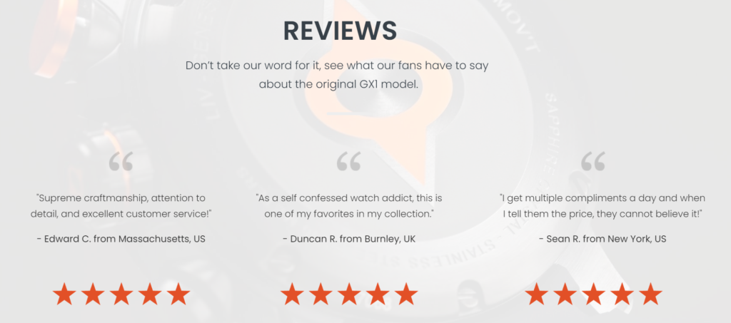
4. Harnessing the Power of Social Proof to Build Trust and Confidence
In the digital age, social proof has become a vital component of effective landing page optimisation. People often seek validation from others before making a purchase decision.
Joel Klettke, Business Casual Copywriting: “Social proof is immensely important for landing pages, to the point that it’s one of very few elements I’ve never seen reduce conversion rates in my own tests. Third party proof does so much at the same time – sets expectations, gives leads a comparison party to weigh themselves against, reinforces your messaging and substantiates your claims”.
Providing reviews on your website can help or facilitate users to make the decision without leaving your site (and getting distracted by other options).
Testimonials can give your visitors a sense of the community you have, and if they fit in with your other customers. This also lends more voice to your landing page, which can help a lead feel more comfortable, and that he is in the right place to get what he needs.
To prove your testimonial is legit, you need to highlight identifying details, typically, this means the full customer name.
5. Building Confidence with Strong Guarantees
A guarantee is a powerful sales and marketing tool and not enough companies use them to their advantage. The goal of a guarantee is to combat objections and make a strong statement.
Users need to feel confident that they are making smart purchases. They need to feel comfortable that when they spend their money, the product will last, and if there’s an issue, the item will be fixed or replaced. Offering extended warranties can actually give the users the opportunity to set expectations about what’s covered and what’s not.

6. The Art of Crafting Compelling CTAs
The call-to-action (CTA) is one of the most crucial elements of a landing page, it guides visitors toward the desired action.
- Make the CTA button prominent by increasing its size and contrasting it against the background. This draws attention and ensures that it’s easily noticeable.
- Place the CTA above the fold, within the immediate view of visitors without requiring scrolling. This placement ensures that the CTA is not missed and encourages immediate action.
- Surround the CTA with whitespace to enhance its visibility and avoid clutter.
- Tailor your CTA to align with the desired action and the needs of your visitors. Finish the sentence “I want to…” to help you determine the most appropriate CTA language.
Maximising Order Value with Cross-Selling Opportunities
When you look at ecommerce as an industry, the two most important numbers in your whole business are your average order value and your lifetime customer value.
There is a final page element, often labeled as “You Might Also Like,” that presents related products or supplementary items to encourage additional purchases.
This section is essential because even if customers don’t immediately convert, you can continue engaging with them and provide additional solutions to their needs.

Optimising the Form Fields to Boost Conversion Rates
The optimisation of form fields is a crucial aspect of landing page conversion rates, with compelling form design acting as a key determinant of user engagement. When done right, form optimisation can make the difference between a visitor leaving your page or becoming a potential customer. To this end, form fields should be structured intelligently, making them straightforward and user-friendly.
In the process of form field optimisation, it is pivotal to keep the number of fields to a minimum; too many fields have the potential to overwhelm visitors, leading to higher bounce rates.
The Art of A/B Testing for Landing Page Optimisation
A/B testing, also known as split testing, is an essential tactic in landing page optimisation that aids digital marketers in understanding user behavior, preferences, and ultimately improving conversion rates. The process comprises two versions of the landing page, version ‘A’ being the control and version ‘B’ being the variant. These versions are simultaneously tested among a similar audience base. The aim is to determine any changes or improvements to the landing page that effectively lead to increased engagement and conversions.
Firstly, marketers must identify elements of the landing page that they believe could affect user actions and conversion rates. This could include anything from the headline, page design, colour theme, call-to-action, forms, images or content. The A/B testing process then requires creating a modified version of the page where one of these variables is changed. With the aid of specialised software, half of the incoming website traffic is directed to the original page (A) and half to the modified one (B). The performance of each page is evaluated based on the specified metric (clicks, form fills, purchases, time spent, etc). The variant that statistically outperforms the other in achieving the desired action is then chosen to be used as the main version. The benefits of A/B testing in landing page optimisation are substantial as they allow marketers to base their decisions on actual data and results rather than approximations or assumptions. In this era of digital marketing, A/B testing should form a critical aspect of every organisation’s conversion optimisation strategy.
Mobile Optimisation: A Must-Have for Landing Pages
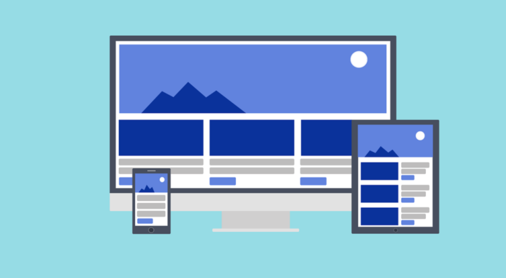
In an era defined by the ubiquity of smartphones, the optimisation of landing pages for mobile devices is no longer a luxury; it is a necessity. The ascendancy of mobile traffic clearly underscores the need for businesses to ensure their digital content is fully accessible and user-friendly on handheld devices. More than half of all web traffic is generated through mobile devices, further emphasizing the critical importance of mobile optimisation for businesses aiming to engage, attract, and convert potential customers.
Mobile optimisation involves redesigning and formatting your website or landing page so that it’s responsive, user-friendly, and navigable on mobile devices. This process begins by ensuring that the content and layout of your landing page provide a seamless experience for users irrespective of the device used. The interface needs to be intuitive, the loading time swift, and the graphics, links, and text should be easy to view and interact with on smaller screens. In essence, a mobile-optimised landing page means more than just squeezing a desktop website into a mobile screen; it means designing a unique, purposeful landing page that serves the mobile users’ needs and enhances their overall browsing experience.
Avoiding Common Mistakes in Landing Page Optimisation
Firstly, it’s essential to understand that the viewer’s attention span is limited. Thus, bombarding users with excessive information or complex navigation can be counter-productive. Instead, stick to simplicity and clarity, ensuring your content is easy to comprehend and your call-to-action is obvious. Secondly, neglecting to perform continuous testing can limit your understanding of user behaviour and preferences. It’s important to carry out regular A/B testing to refine and enhance the overall user experience. Lastly, many make the error of not optimising their landing pages for mobile devices. With the significant surge in mobile internet users, failing to optimise for mobile platforms could result in missing out on a vast number of potential conversions
Continuous Improvement: The Key to Landing Page Success
Continuous improvement starts with understanding that a landing page isn’t a static entity, but a dynamic one that requires strategic refinement over time. Analysing visitor behaviour, testing new elements, refining designs and addressing user objections are integral parts of this journey. Since more audiences interact with brands online, having a well-optimised landing page remains a valuable asset. It, therefore, stands to reason that a commitment to routinely enhance and evolve the landing page can dramatically increase conversion rates. Every aspect, including the headline, copy, images, calls-to-action, form fields, social proofs and more, should be relentlessly analysed and refined. This practice ensures the landing page stays relevant, compelling, and ultimately, successful in turning audiences into customers.